Design systems for SaaS: how to build one that actually scales
A practical guide to design systems - what they are, when you need one, and how to build a system that speeds up development and keeps your product consistent.
:quality(82)/blog/authors/giustino.webp)
:quality(82)/blog/design-systems/1vrs8ap3JFGY5ytsRU0d7FEjv3w.png)
UI design has come a long way, and with so many apps and websites out there—each with countless screens and pages—the design process can get pretty overwhelming. As the demand for faster development and seamless user experiences grows, teams need a way to simplify their workflows without sacrificing quality or consistency. That’s where design systems come in. These handy sets of standards and reusable components help teams work faster, collaborate more easily, and ensure every part of a product looks and feels cohesive.
Big names like Airbnb, Uber, and IBM have transformed their design process by creating their own custom design systems. This shift has allowed them to innovate at a much faster pace while keeping their products consistent, no matter how complex they get. Whether you’re designing a mobile app, a website, or even a car’s interface, a solid design system helps keep everything streamlined and on-brand.
Design systems might not always be the stars of the show, but they’re the unsung heroes behind the products we use every day. They act as the foundation that supports every element of the user experience, ensuring that users enjoy a smooth, familiar journey no matter where they interact with a brand.

What is a design system, really?
A design system is essentially a toolkit that helps teams maintain consistency across all their digital products. It’s made up of reusable components, design principles, and guidelines that work together to create a unified experience, no matter how many pages or screens the team is working on. Think of it as a framework that offers both structure and flexibility, allowing teams to quickly build new features while keeping everything aligned visually and functionally. But let’s be clear: a design system isn’t just for designers, it’s a vital resource for developers too. It includes code snippets, documentation, and even design patterns that help streamline development and reduce confusion. This shared foundation allows designers and developers to collaborate more effectively, ensuring that every part of the product looks cohesive and functions smoothly. In simple terms, a design system is like having a master plan that guides the creation of digital products. It saves time by reducing the need to constantly reinvent elements and patterns, letting teams focus more on innovation and less on repetition. With a solid design system in place, teams can build faster, stay consistent, and create experiences that feel seamless to users, no matter where they engage with the brand.
Back to the roots
Design systems may feel like a modern invention, but their origins date back decades. The idea of using “systems” in design first appeared in the late 1960s at the NATO Software Engineering Conference, where architect Christopher Alexander introduced the concept of patterns in his book A Pattern Language (want to know more? Check our cureted list of resources here). Though initially applied to architecture, his approach to creating interconnected design solutions laid the groundwork for the systematic thinking we see in today’s design systems.
As technology grew, so did the need for consistency in design. Back in the day, graphic designers used style guides and typographic rules to keep branding cohesive across printed materials. Then, as brands started growing and reaching wider audiences, especially in the mid-20th century, they created comprehensive guidelines to make sure everything looked and felt consistent, whether on a billboard or in a brochure.
Fast forward to the digital age, and these same principles found a new home on our screens. Companies like Apple, Google, and IBM were among the first to develop design languages that kept their products looking sharp across everything from early computers to websites and apps. These weren’t just pretty guidelines—they were packed with practical tools to help teams move faster and stay on the same page. What started as style rules for print has now blossomed into the design systems that power our favorite apps, websites, and digital experiences today.
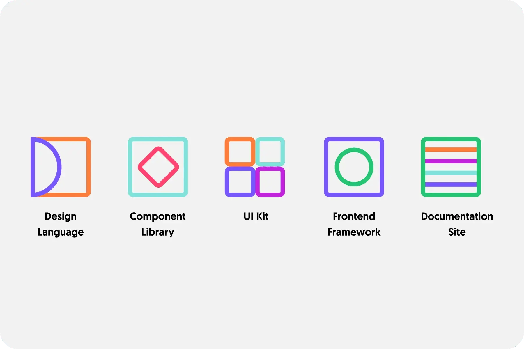
The anatomy of a design system
As we’ve discovered, a design system is not a simple collection of UI elements. It’s an organized structure that guides the entire design and development process. You can think of it as a hierarchy, with each layer building on the next to create a cohesive system that ensures consistency across all your digital products. Let’s break it down:
- The big picture – Design system At the very top, you have the design system itself—your overarching guide to everything design-related. This is the foundation of your product ecosystem, constantly evolving to include technical specifications, design tokens, documentation, and best practices. It’s not just about how things look, but also about how they function, providing core principles and processes that shape UX decisions and development.
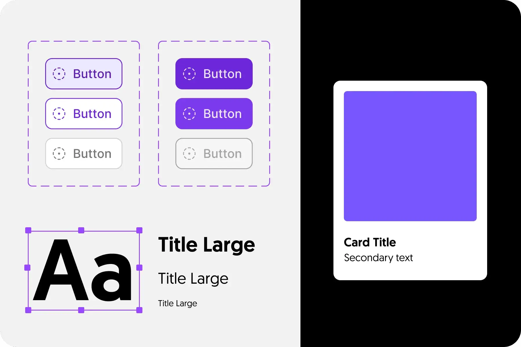
- The building block – Component and patterns libraries Beneath the design system are the component and pattern libraries, which serve for creating consistent, reusable design elements. These libraries are home to templates, layouts, interaction patterns, and code snippets, all supported by detailed documentation. Designers and developers use these pre-built elements to speed up their workflow and maintain a consistent user interface across products. Essentially, this is the go-to resource for anyone on the team to find exactly what they need to bring the design to life.
- The visual language – Foundation elements At the core of any design system are its foundational elements. This is where the visual identity of your product takes shape, including essential aspects like color palettes, typography, icons, logos, and illustrations. These elements define the overall look and feel of your brand, setting the tone for how users experience your product. Accessibility and brand guidelines also fall under this category, ensuring that your product is inclusive and stays true to your brand’s voice.
Why is it important?
One of the biggest misconceptions about design systems is that they limit creativity, enforcing rigid uniformity across designs. In reality, design systems do the opposite: they empower designers by solving for repeatable patterns, freeing them up to focus on more complex challenges. By providing a library of reusable components and guidelines, design systems allow teams to quickly switch between modes and screen sizes without duplicating efforts, enabling greater flexibility and efficiency. By handling the repetitive tasks like creating buttons or form fields, design systems give designers more time to dive deeper into critical areas such as improving user flows, refining accessibility, or crafting more intuitive experiences.
Design systems serve as a single source of truth, ensuring that updates made in one place automatically propagate across the entire product. This keeps everyone—from designers to developers—on the same page, fostering collaboration and reducing miscommunication between cross-functional teams.
So, beyond just design, a well-implemented design system can significantly speed up the development process. When components are created with development in mind, including tokens and animation presets, developers can translate them into functional code more efficiently. This leads to faster time-to-market and more consistent user experiences across platforms and products.
For companies, leveraging a design system means greater visual consistency across all touchpoints—whether it’s a website, app, or another platform. It eliminates the risk of fragmented experiences and ensures that products look and feel cohesive, even when teams work in silos. Plus, when it’s time for a major visual rebrand or update, a design system allows those changes to be implemented at scale with ease.
Do you need a design system? Here’s how to find out
Deciding when to implement a design system isn’t always straightforward—it’s more about recognizing the right moment based on your team’s needs and challenges. A design system is a strategic investment, so how do you know if it’s the right time for your organization?
- Start by looking for inconsistencies in your product’s design. If you notice that the look and feel of your app or website varies across different platforms, or that your brand identity feels disjointed from one experience to the next, it’s a clear sign that a design system could help unify things. Consistency is key to a strong user experience, and a design system ensures everything stays aligned, no matter where users interact with your product.
- Next, consider whether your product needs to support multiple themes or platforms. If you’re juggling light and dark modes, different brand identities, or various device platforms and screen sizes, a design system can help manage this complexity with ease. It allows your team to quickly adapt designs to fit any environment without starting from scratch each time.
- Another red flag is design redundancy. If your team is constantly repeating the same design tasks—like rebuilding buttons or resizing elements—it might be time to streamline the process. A design system standardizes these elements, so your team can focus on bigger challenges instead of getting stuck in the weeds.
- Finally, think about your product’s development lifecycle. Are there bottlenecks in design, prototyping, or updates? A design system can drastically improve efficiency at every stage, from speeding up design iterations to simplifying future updates. If you’re looking to optimize your workflow and keep your team on track, a design system could be the perfect solution.
By assessing these factors, you can determine whether a design system is the right choice to help your team work smarter, not harder.
Let’s get to work: how to build your design system
Building a design system can seem like a daunting task, but breaking it down into clear steps makes the process much more manageable. Here’s how to get started:
-
Start with a Visual Audit
First things first, take a look at what you already have in place. Whether it’s for your app, website, or another digital product, gather all your existing design elements and styles. This helps you see what’s working, what’s not, and how much work lies ahead to create a more unified system.
-
Define your visual design language
This step is all about creating the core look and feel for your product. Your visual design language will include things like your color palette, fonts, and spacing rules. Choose a few primary brand colors and build some lighter and darker versions for flexibility. Keep typography simple by sticking to one or two fonts, and set up a consistent system for sizing and spacing elements, like buttons and text blocks. Lastly, decide on a style for your imagery, whether it’s icons, illustrations, or photos, so everything feels cohesive.
-
Build your UI/pattern library
Now, it’s time to gather all your existing UI components—think buttons, forms, icons, and images. Go through them, merging similar elements and getting rid of anything redundant. This step helps you create a streamlined library of reusable design components that will save time and ensure consistency across your product.
-
Document everything
To make your design system truly functional, documentation is key. For every component, write down clear guidelines on when and how it should be used. This ensures that everyone on your team—from designers to developers—can easily apply the system and maintain consistency across all projects.
Think it thorough: is it all that good?
While design systems offer plenty of advantages, they’re not without their challenges. Building and maintaining one can be a time-consuming task that requires ongoing attention. Design systems aren’t a “set it and forget it” kind of solution—they need a dedicated team to keep them up to date and evolving as your product grows and user feedback rolls in.
Another hurdle is the learning curve. Even the best design system needs clear instructions on how to use it, or teams run the risk of misapplying components, which can lead to inconsistencies across products. Training your team to adopt and use the system properly is an investment of both time and effort.
Finally, there’s sometimes a perception that certain projects are one-off endeavors, so there’s no need for reusable components. If this thinking persists, it can signal a lack of strategic alignment across teams and lead to missed opportunities to streamline workflows and boost efficiency.
In the end, a design system can be a game changer—but only if your team is committed to maintaining and utilizing it effectively. It’s a long-term investment that pays off in efficiency, consistency, and collaboration, but it’s important to weigh the potential challenges alongside the benefits before diving in.
Still not sure what to do? Check this page and let us help you with that! Contact us and tell us your challenges and goals!
:quality(80)/blog/gui-was-a-patch/the-gui-was-a-patch.png)
:quality(82)/blog/pragmatic-b2b-saas-design-listing/GvPwajE4C3d7q8qkK9y2Lgmpd0.png)
:quality(82)/blog/introduction-to-design-tokens/pJG6ebrc0tzPoDQWWSZXolLXUPE.png)