Getting Started with Product Analytics: How to Get Insights from Your Data
The third step of a successful Product Analytics strategy is to ask good questions
:quality(82)/blog/authors/giustino.webp)
:quality(82)/blog/how-to-start-product-analytics-insights/xK6ROTS3HiNLGh6oyJ8UEbMkmg.png)
Welcome to the third and final episode of our Product Analytics mini-series.
In our last article, we looked at how a good tracking plan can help us define our goals and understand which events to track.
After we’ve done this, and the data starts flowing into our tool of choice, we are responsible for gaining insights from all this information.
In this article, our focus is on the principles used to gather these insights. While I will be using Mixpanel, I advise you to use the tool that is best adapted to your project’s needs. The principles discussed here can be translated to the tool you and your team choose to use (they are not tool-specific).
The principles we will cover today are:
-
Know your data
-
Craft the right questions
-
Create clear visualizations
Start by getting familiar with the data
One of the first things you should do after implementing your tracking plan is to ensure that the events and relative properties are being recorded properly.
Many tools contain a list of events and associated properties (in Mixpanel, you can find them in the Lexicon).
You should check two things at this initial stage:
-
that all the events listed in the tracking plan are indeed being tracked,
-
and that all the event names are consistent.
Occasionally some events don’t get tracked during the first implementations, so it’s important to go through all the triggers and make sure that all events are being fired.
Keeping event names consistent is a key step in any good tracking plan.
For example, if we decide that the structure of an event name is action[space]subject we should be sure that all of the names are like that. So order sandwich is OK, while sandwich ordered or order_sandwich are not.
If you have followed all the steps so far, the names should already be consistent. However, it always makes sense to check them again in case there are some exceptions that might have been missed (e.g. if you already have some legacy events, check to make sure those event names follow the new rules).
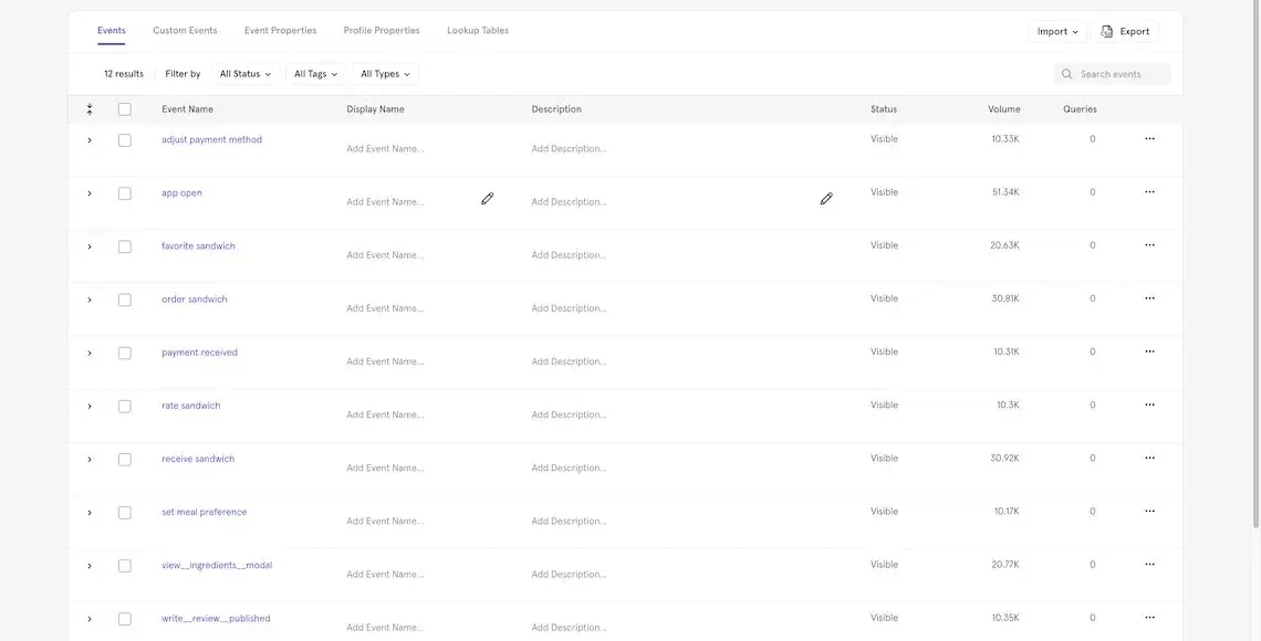
Mixpanel’s Lexicon
You should do the same for the user profile attributes: make sure they are being tracked and that the naming conventions are consistent.
Great insights come from good questions
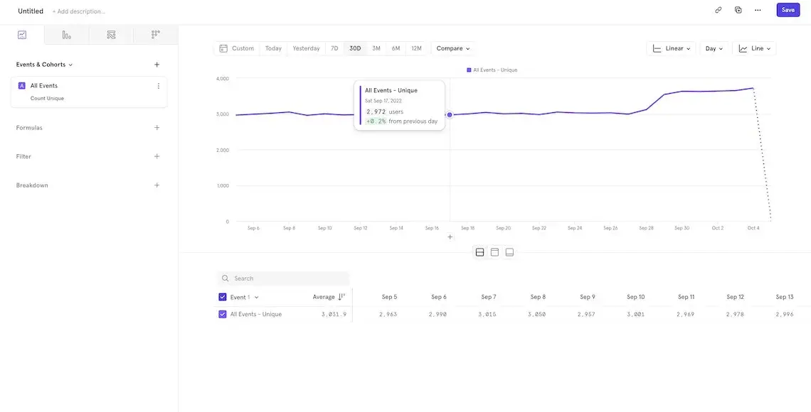
Asking good questions is fundamental to get the right insights
Once you have made sure that the events are indeed being tracked by your tool of choice, the next important activity is to clearly define what you intend to do with this data.
For example, some common metrics are:
-
Daily Active Users
-
Engaged Users
But what do those terms really mean? These definitions are good as labels, but they don’t help us understand what kind of insight we want from the data.
Let’s examine the first one: Daily Active Users (DAU) is a common metric for SaaS products to track. If we decompose the label, what we’re looking for is the answer to these questions:
-
How many users does our product have every day?
-
Among these users, how many are active?
This is already better: we now know more about the information we want to gather. We can start by getting the number of unique users that use our product daily.
However, the second question contains an additional definition: what do we mean by “active”?
When working with product analytics, we encounter a lot of these adjectives - many of which don’t have a clear definition. Active, Engaged, Onboarded: no unique trait characterizes these sets of people.
So, when crafting questions, one of the most important activities is to align the whole team on the meaning of these words and possibly write these definitions in an accessible glossary.
Let’s take “active” as an example: it could mean that any user that has done at least one action per day is considered active.
Or only users who have completed a certain action (like ordering a meal)
Or users that have at least 2 sessions per day.
Depending on the goal and the usage pattern of your app, any of these definitions could work.
That’s why it’s so crucial to define these adjectives in regard to your product and make sure the whole team understands each adjective’s definition.
A clear visualization is fundamental
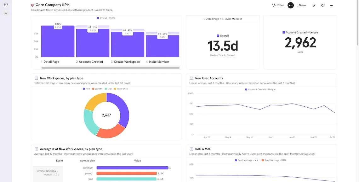
A clear visualization is core to convey the right messages to your audience
After creating precise questions that lead you to the insights you need about your product, it’s time to share your hard-won results. So what is the best way to show these important results?
When describing a concept, we take time to craft the words and phrases of a speech: should they be direct and pragmatic, or more academic and open to interpretation?
The same is true of data visualization. You can hide hard truths behind a nice colored chart, or you can help your readers by selecting the right chart for the job.
So how do you choose the right data visualization? Here are some guidelines:
-
Line charts are perfect for time series, as the presence of two axes enables you to show trends;
-
Pie charts are useful when dealing with a finite set of groups (5-7 is the perfect number), and if you want to compare the size of a section of the pie relative to the various groups;
-
Data tables are the best tool when you need to sort data and compare rows and columns;
-
Funnels are best equipped to represent multi-step journeys since the steps don’t need to be a single action - they can represent logical sets;
-
Sankey diagrams are the chart to use when you want to show flows and journeys from one step to the other (e.g. what actions do people do after visiting the pricing page of your product?).
Another important step in sharing your results is to group them into meaningful dashboards or slides: don’t just throw all of your charts into one page and call it done.
Try to separate financial data from product data and marketing insights. In this way, various teams can go directly to the data figure that interests them the most, reducing the signal-to-noise ratio of showing too much information on just one page.
Conclusion
And that brings us to the end of our Product Analytics series!
We hope that it’s helped break down some of the key steps and principles of this fascinating process.
If there’s one message to take away, it’s that product analytics is not a “one size fits all” process: there is not a single path to be followed that will bring success.
It is crucial to analyze your business needs and goals so that you can use these tools in the right way for your team, so take the time to work out what your team, project, and organization needs.
With this personalized information, you will be able to craft the best path forward and understand more about how your product is performing in the market.
If you would like more help or support, feel free to reach out to us at hello@donux.com: we’ve helped many clients find the right path forward.
And if you enjoyed this article, please share it on Linkedin or Twitter!
:quality(82)/blog/how-to-start-product-analytics-tracking-plan/ijS1NAr30UDy7eACQ2bkVLKXRg.png)
:quality(82)/blog/how-to-start-product-analytics-business-goals/uZrOeP8prPQOOcVxeAcDaaRTe0.png)