Pragmatic B2B SaaS Design: The Listing Page
A listing page is one of the most common screens in B2B SaaS. Here’s a practical checklist covering every element you need, when to use each pattern, and how the best products implement them.
:quality(82)/blog/authors/yana.webp)
:quality(82)/blog/pragmatic-b2b-saas-design-listing/GvPwajE4C3d7q8qkK9y2Lgmpd0.png)
This year, Donux will be four years old. In the last years, we’ve collected many playbooks, best practices, tips, and other assets that we use internally to build the right product faster.
So we thought, why don’t we release them freely for every product team to use?
Many team members have a long time of experience contributing to open-source projects, and this is our way to give back to the whole product and design community, which has given us a lot.
Every article in the series will expand on a topic: we’ll start with common screens in many B2B SaaS products and then explore patterns and product activities. (If you don’t want to miss an article, make sure to subscribe to the newsletter)
But this is a pragmatic series, so let’s get started!
The listing page: definition
A listing page, in the context of B2B SaaS applications, is a screen that displays a collection of items, records, or entities in a structured format, often as a list or table.
These items could be products, services, user accounts, transactions, files, or any other data relevant to the application’s users.
The primary purpose of a listing page is to provide a clear overview of available data or options, enabling users to quickly find, understand, and interact with the information they need.
How might we design a good listing page?
A good listing page comprises many items, some required and some useful, depending on the context. Use this checklist as a starting point to design a good listing page.
Required elements for a SaaS listing page
These are all the elements you must add to design a good listing page for your product:
1. Choose the card type that most effectively represents your data
- Card row
- Card
- Table
2. Ensure to add at least these elements (to learn more about the types of elements and their application contexts, consult the attached tables)
- Title
- Content
- Filters
- Pagination
- Sorting
- Empty state
Additional/Optional elements
On some occasions, you may need some additional elements to guide the user more (to learn more about their application contexts, consult the next chapters):
- Call to action (if required for the list)
- Search
- Sections or categories
- Total number of elements
- Skeleton/loader
Content types for a good listing
The type may vary depending on the information shown (e.g., if there are many numbers or texts to compare, the table may be the most suitable solution, while if images are shown, the card is better suited).
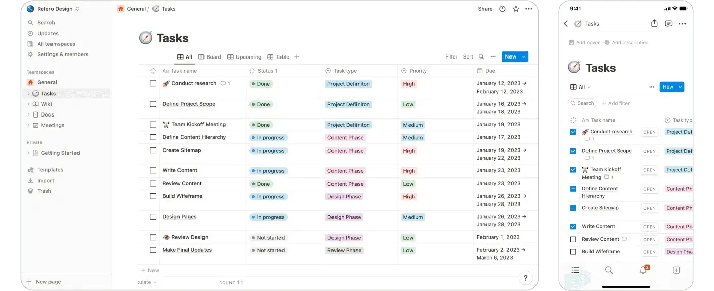
Card row
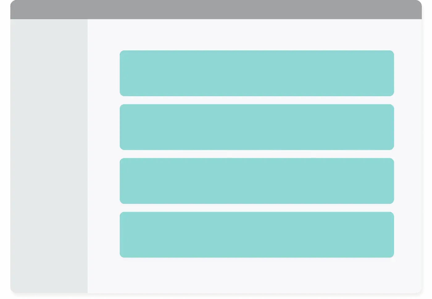
Card row
Main reasons to use it ✅
- it is useful when there is a lot of information in different formats (e.g., photos, text, CTA, etc.)
- it facilitates the reading of longer texts (in the table version the rows may become too wide)
- it avoids horizontal scrolling which makes reading more difficult
- the layout is easily adaptable to mobile to make content responsive
When not to use it ❌
- it is not suitable when there is a lot of data to compare
Card Row Examples
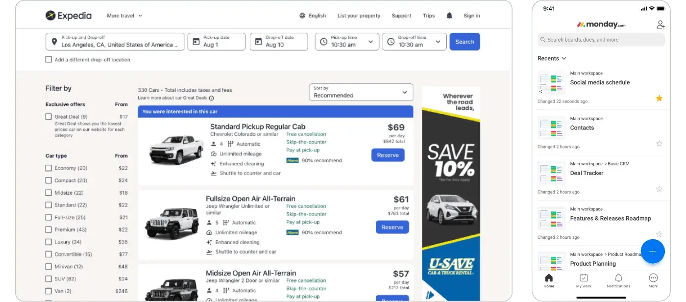
Expedia and Monday.com use row cards to display all the required data
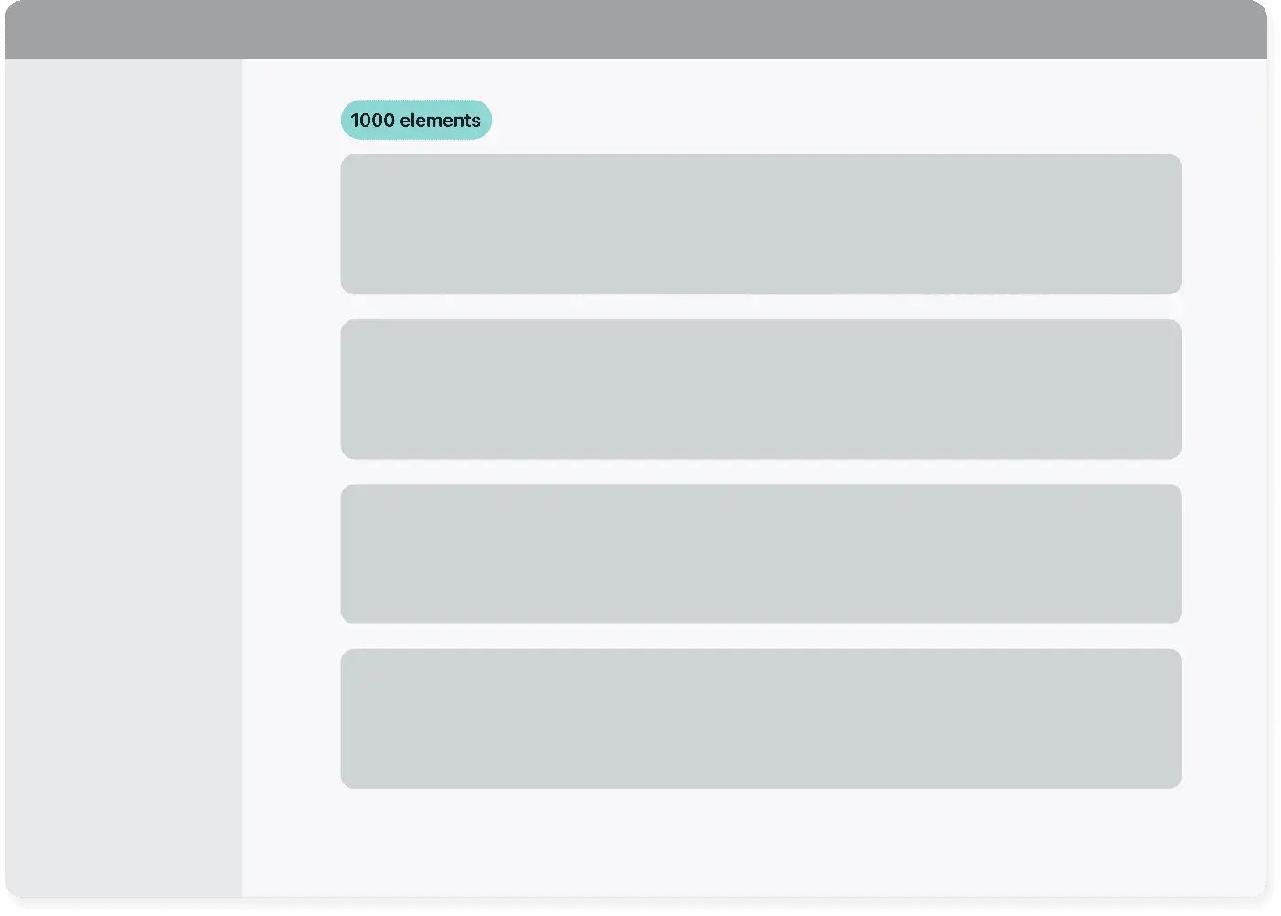
Card grid
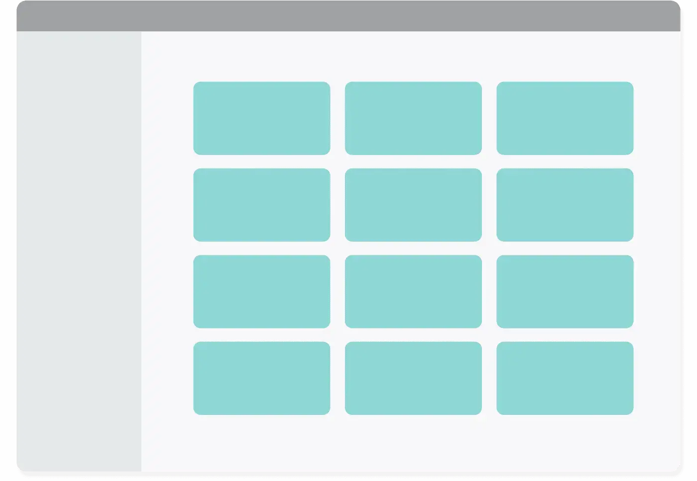
Card grid
Main reasons to use it ✅
- it is useful for having an overview of the data
- it is suitable if there isn’t too much information (it’s compacted and it’s easier to read it as a whole)
- it avoids horizontal scrolling which makes reading more difficult
- the layout is easily adaptable to mobile to make content responsive
When not to use it ❌
- it is not suitable when there is a lot of data to compare
Examples
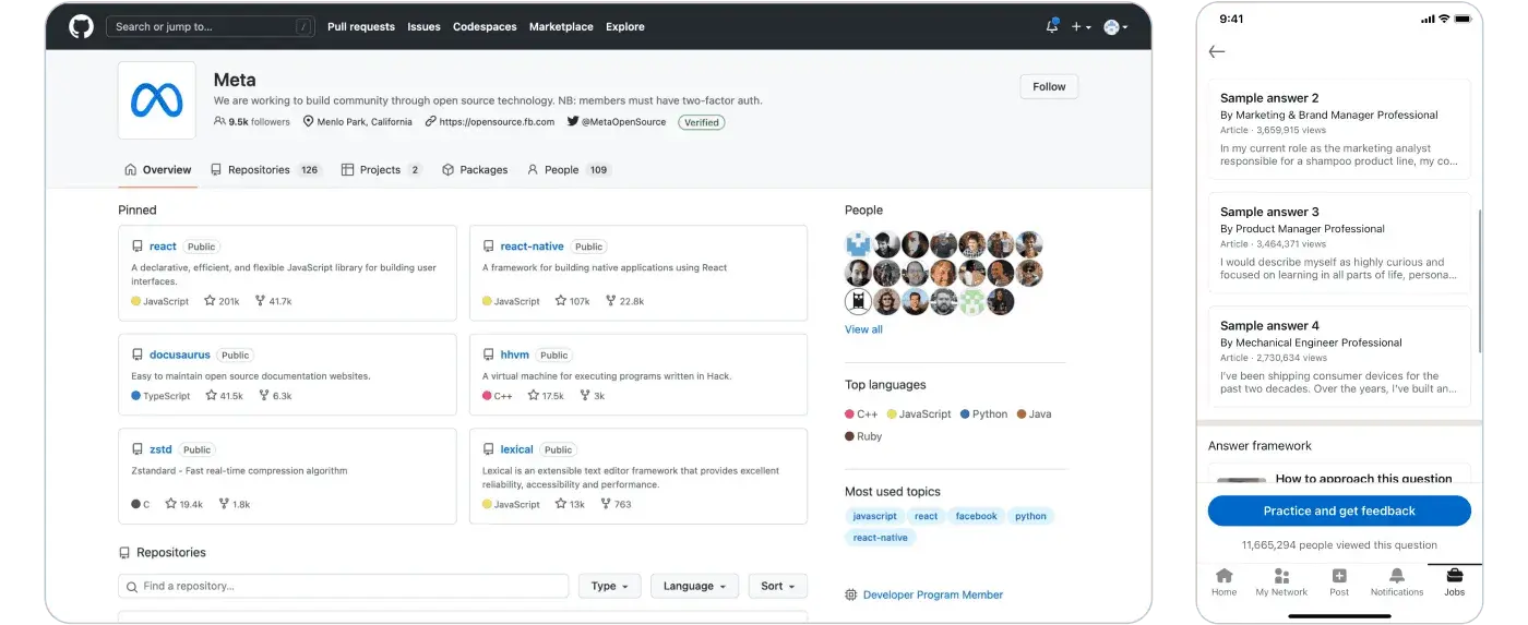
GitHub and LinkedIn using a Card grid
Map listing
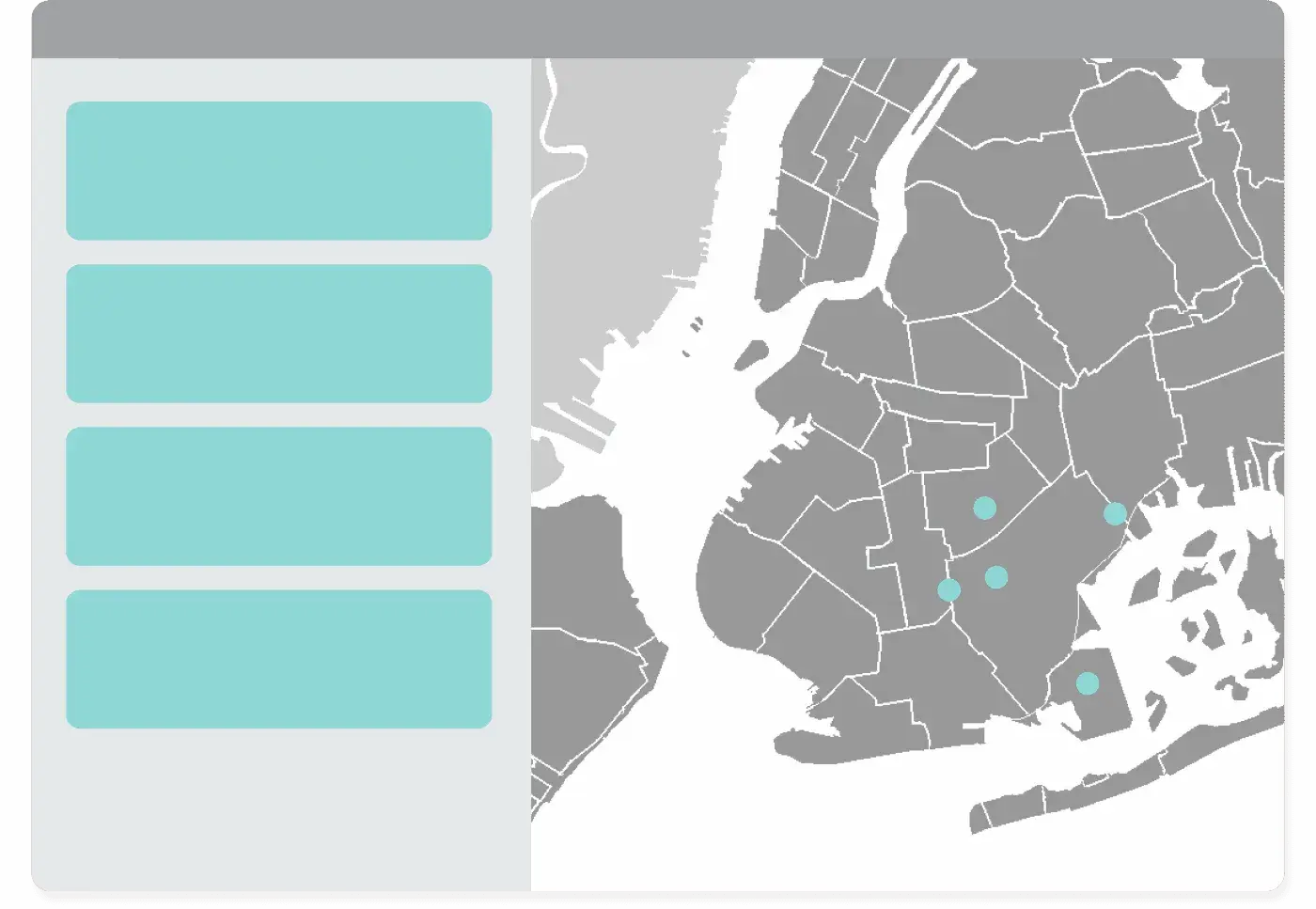
Map listing
Main reasons to use it ✅
- it is useful for locating the elements of a list in a specific context
- UI elements facilitate the distinction into categories of items
When not to use it ❌
- it’s a complex UI pattern that requires dexterity. Take your target audience into account
Examples
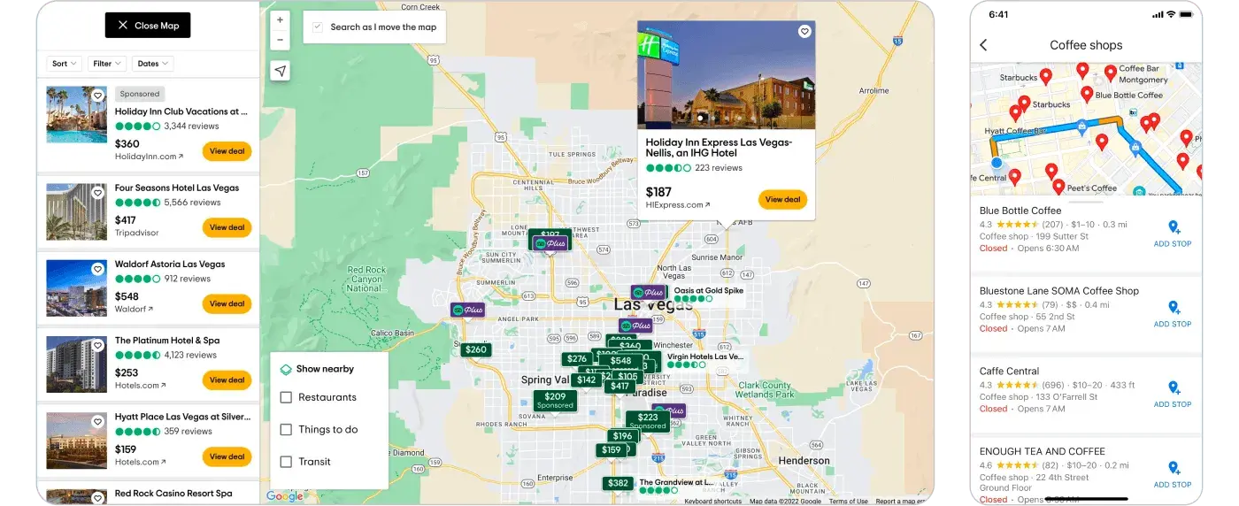
Trivago and Google Maps using Map Listing
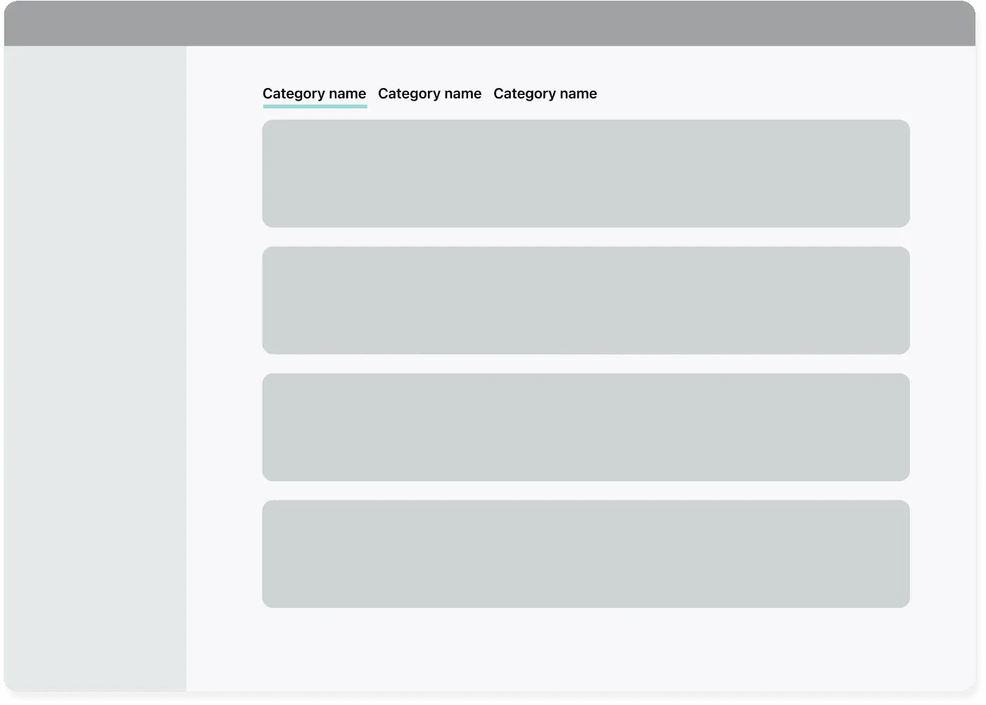
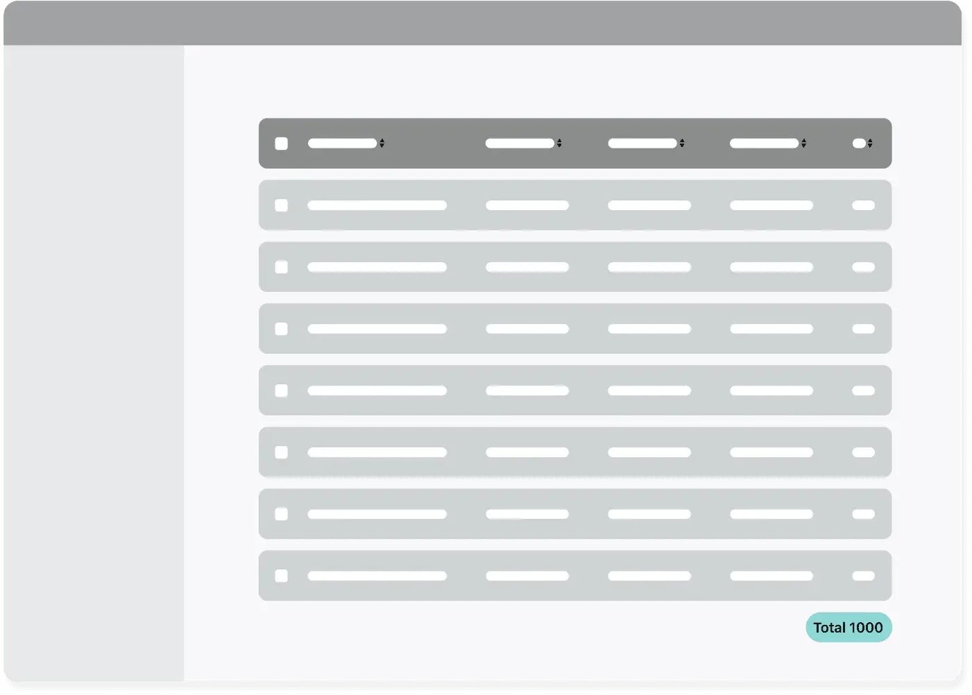
Table
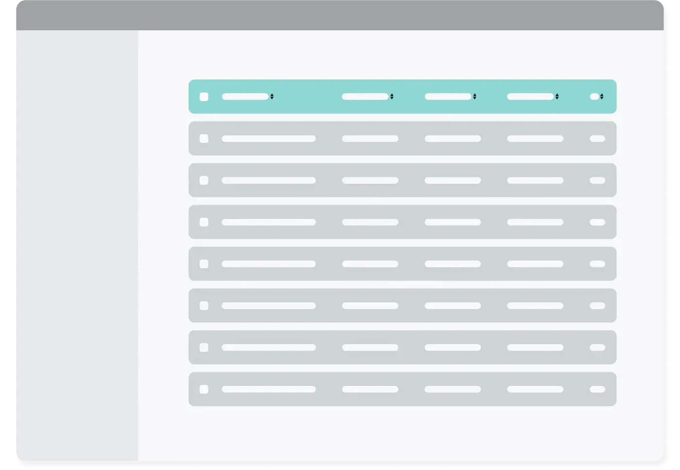
Table
Main reasons to use it ✅
- it is useful for a direct comparison of elements, especially if there are many
- it facilitates bulk actions
- it is not necessary to repeat the labels/categories relating to the information
When not to use it ❌
- it is harder to read horizontally on mobile
Examples
Notion using Table pattern
Types of filters for a SaaS listing
Before starting to design your filters, remember that:
- Filters must reflect the information contained within the list
- It is important to prioritize the order in which the filters are displayed (there may be information that needs quicker access)
- Define the limit of filters to apply, an excessive number could complicate
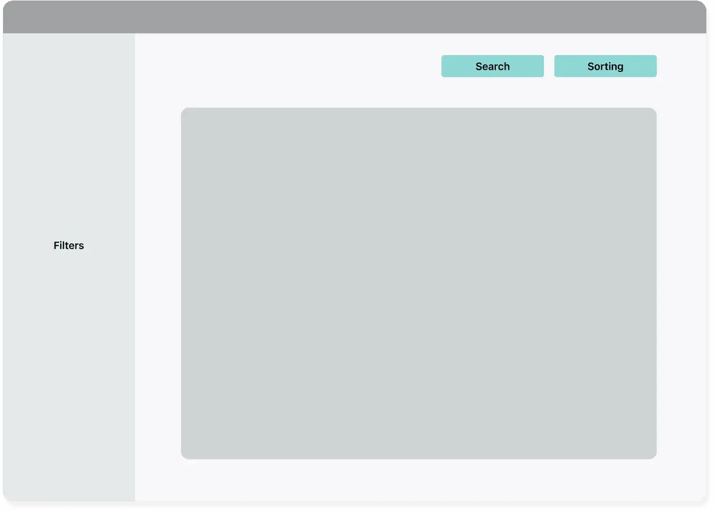
Sidebar filters

Sidebar filters
Main reasons to use it ✅
- when there are multiple filters with a greater number of values within them (they can be expandable)it is more scalable in terms of space (unlike the bar, which is limited to the width of the page. This means that the user has to navigate between drop-down menus)
- it allows us to immediately have a view of their application without losing the context
When not to use it ❌
- When the number of filters is limited, you could gain horizontal space by using a different pattern
Examples
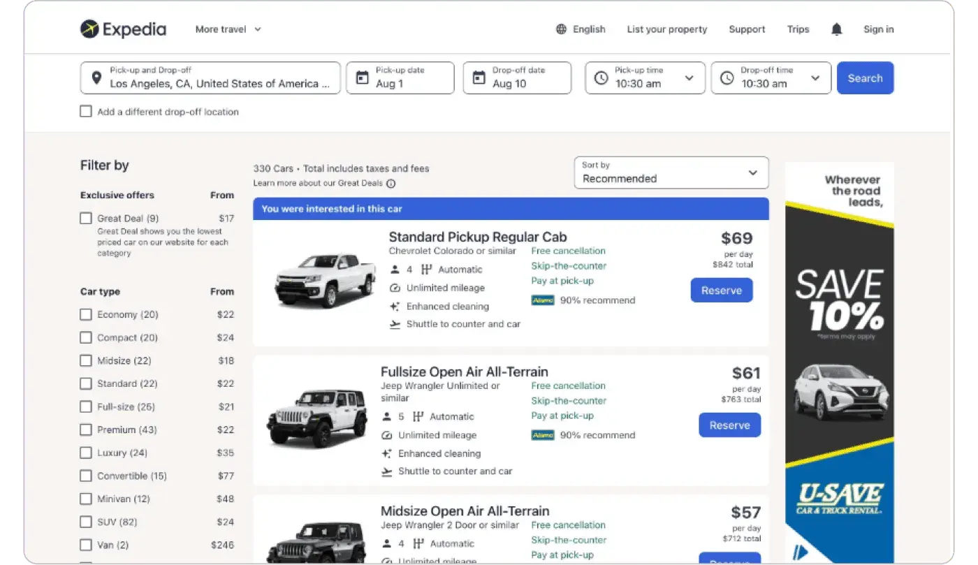
Expedia using sidebar filters
Filter area
Filter area
Main reasons to use it ✅
- the filter area can be positioned in specific parts of the page (e.g. if there are different categories or tabs), but it is important to make it clear what they apply to
- it allows us to immediately have a view of their application without losing the context
When not to use it ❌
- the space may be limited if there are many filters
Examples
A filter area in action in Toggl
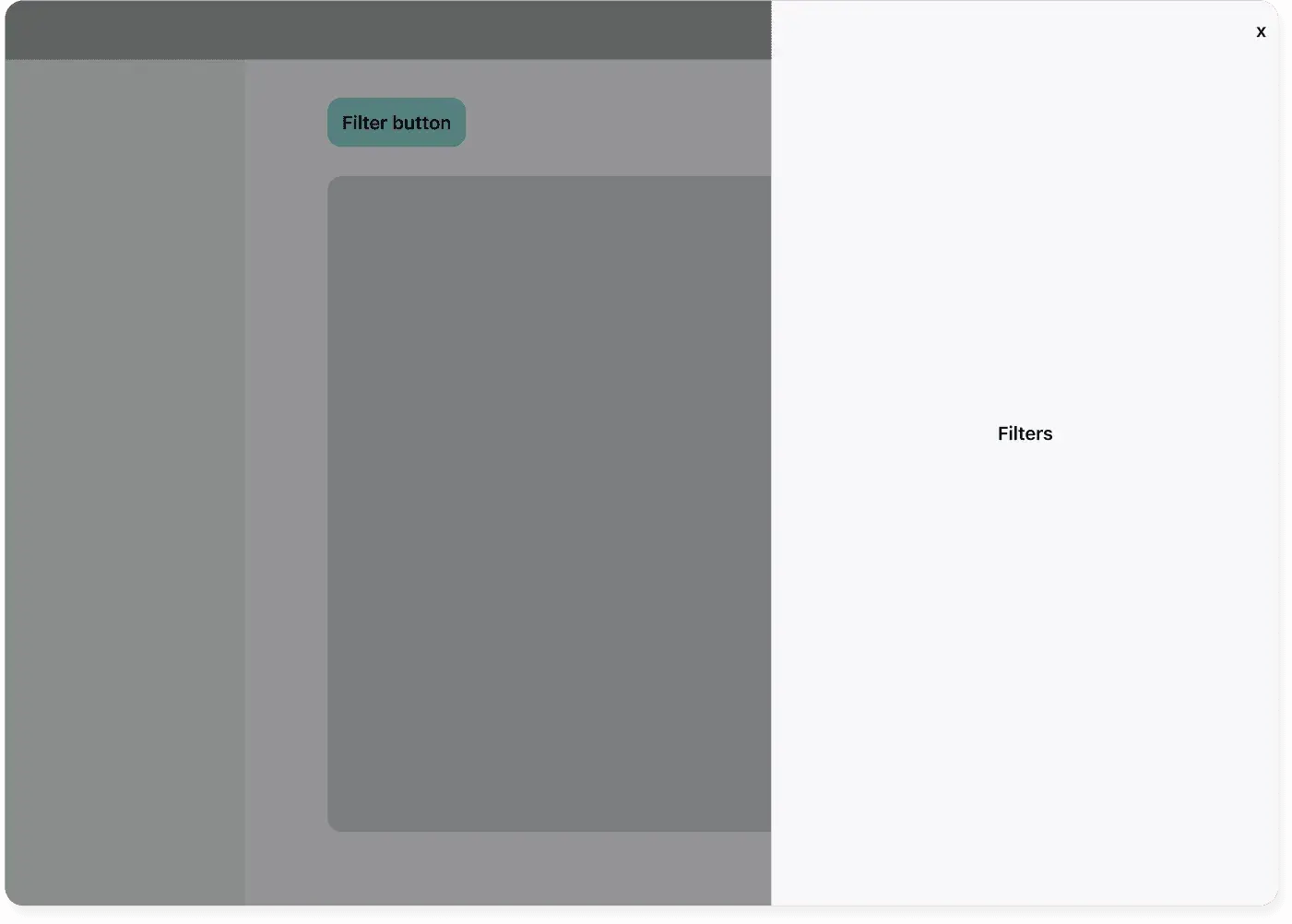
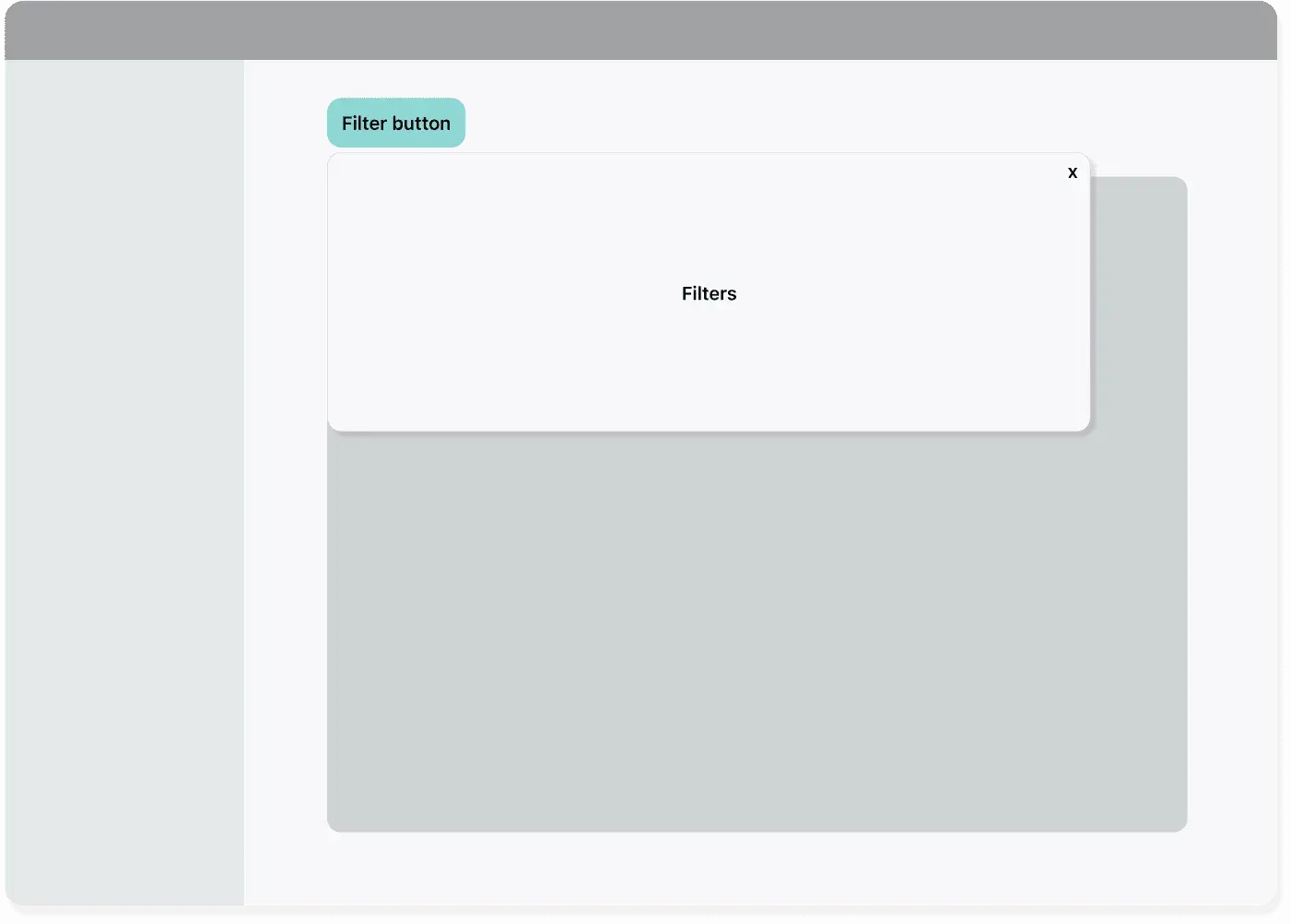
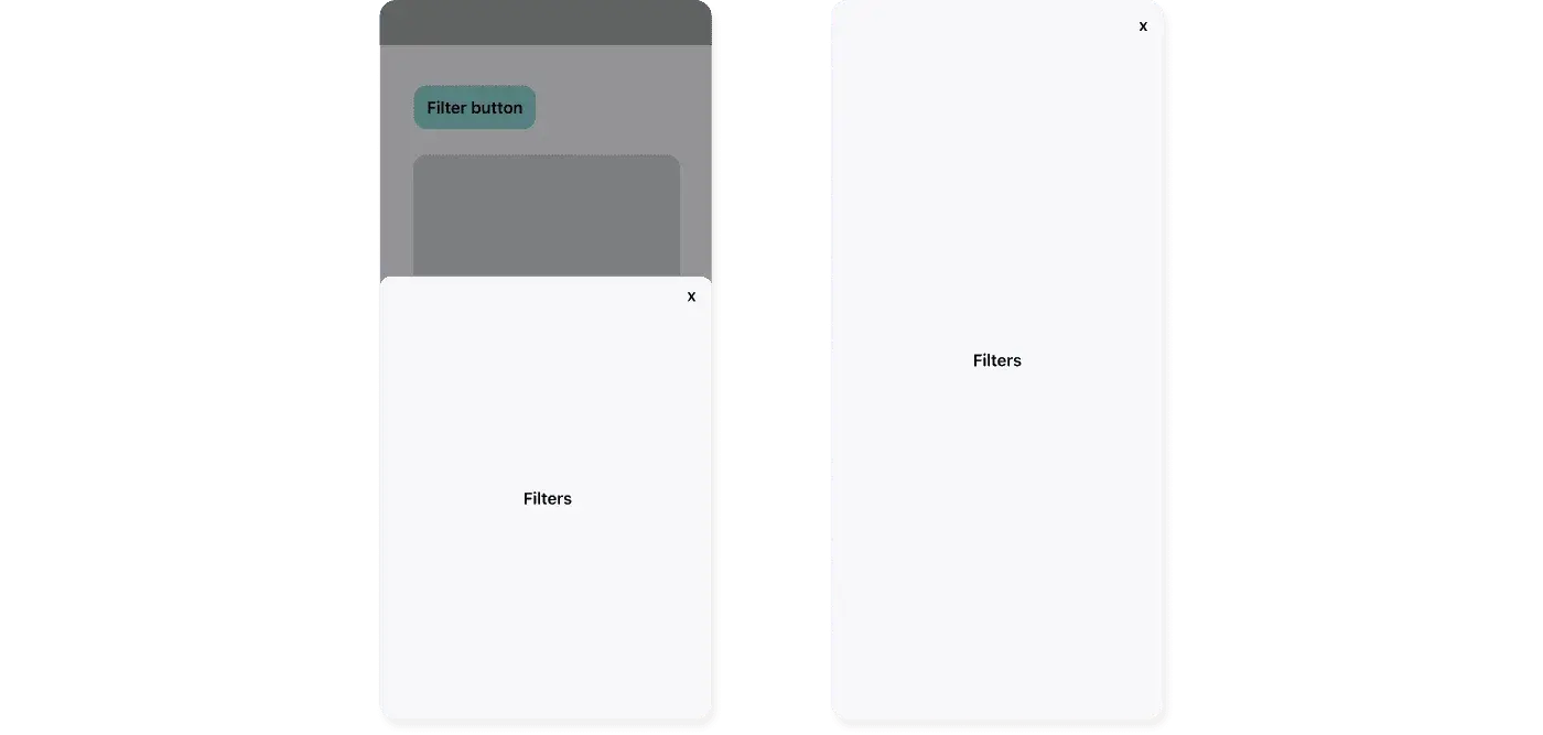
Filter button
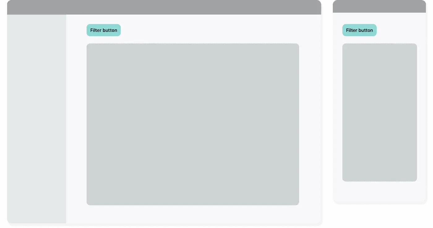
Filter button
Main reasons to use it ✅
- it is an alternative to the sidebar for when there are a lot of filters
- it works well on mobile
When not to use it ❌
- when the button is active the user may lose the application context
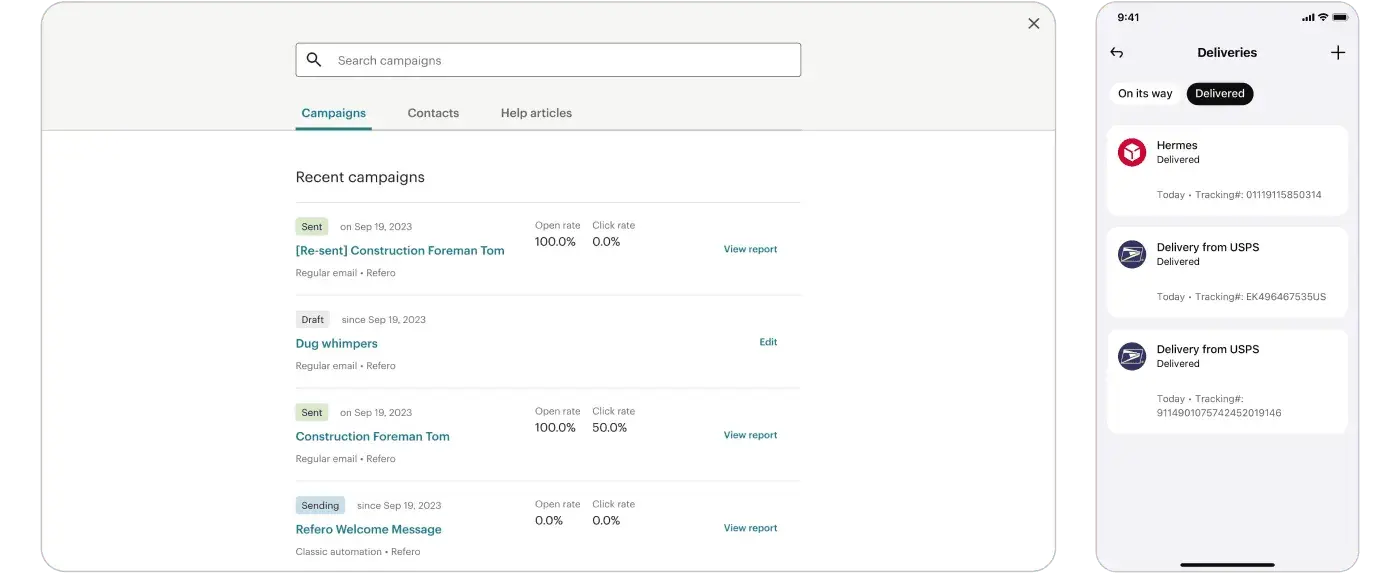
When using a filter button, you can use three different interactions to open the filters:
- modal
- drawer
- popover
Examples
Filter button in action
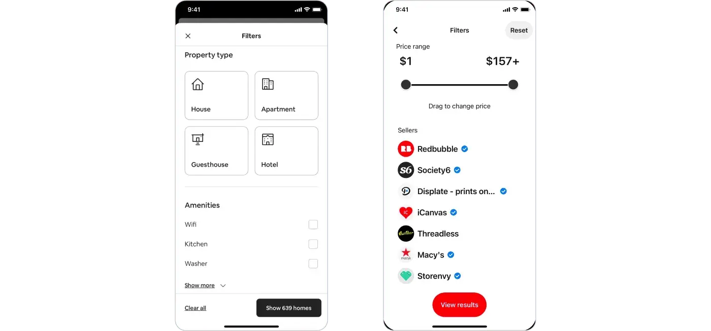
Filter button interactions: modal
Best used when the focus should be on the filters, or the filters themselves involves complex logic.
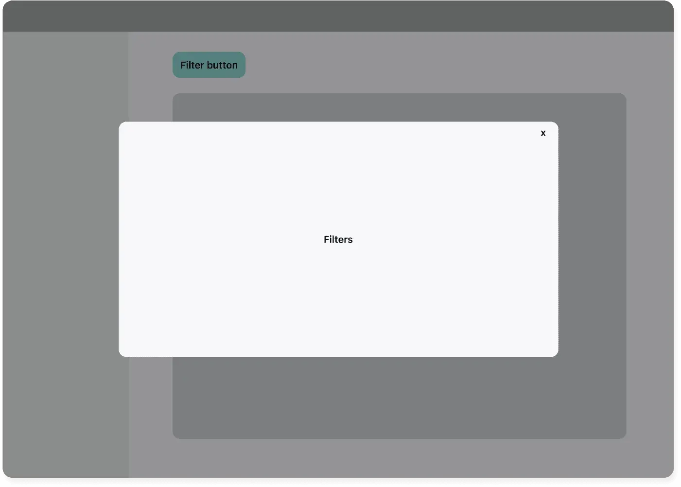
Filter button: modal
Examples
Filter button: modal in action
Filter button interactions: drawer
This is useful when people need to peek at the context where the filters are applied.
Filter button: drawer
Examples
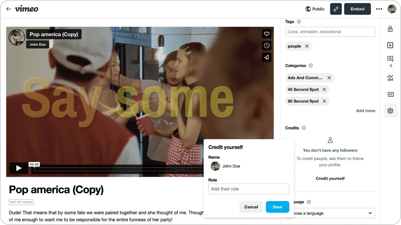
Filter button: drawer in action on Vimeo
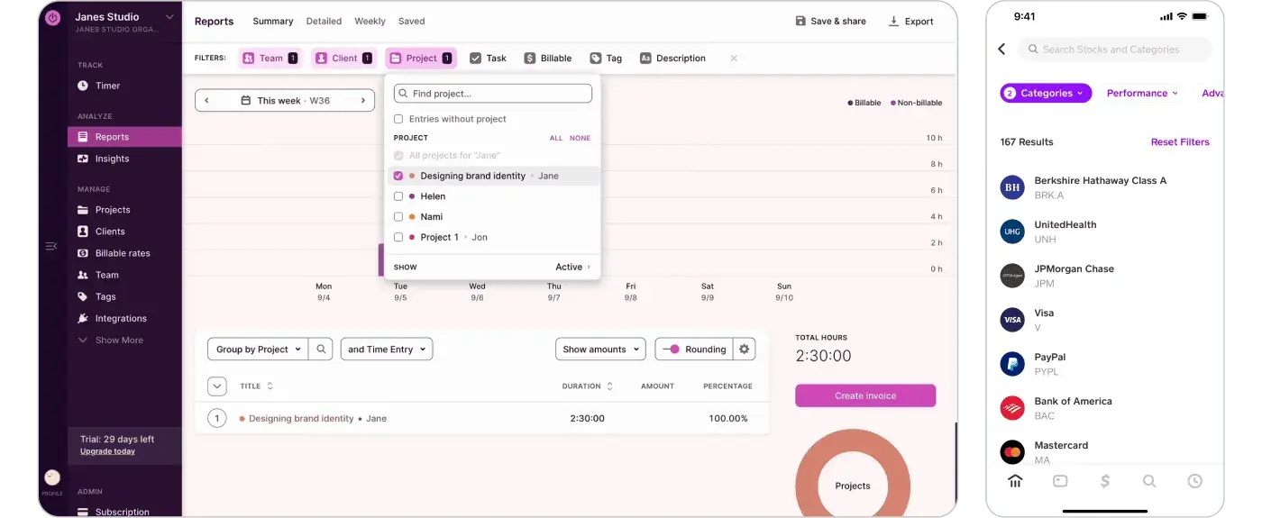
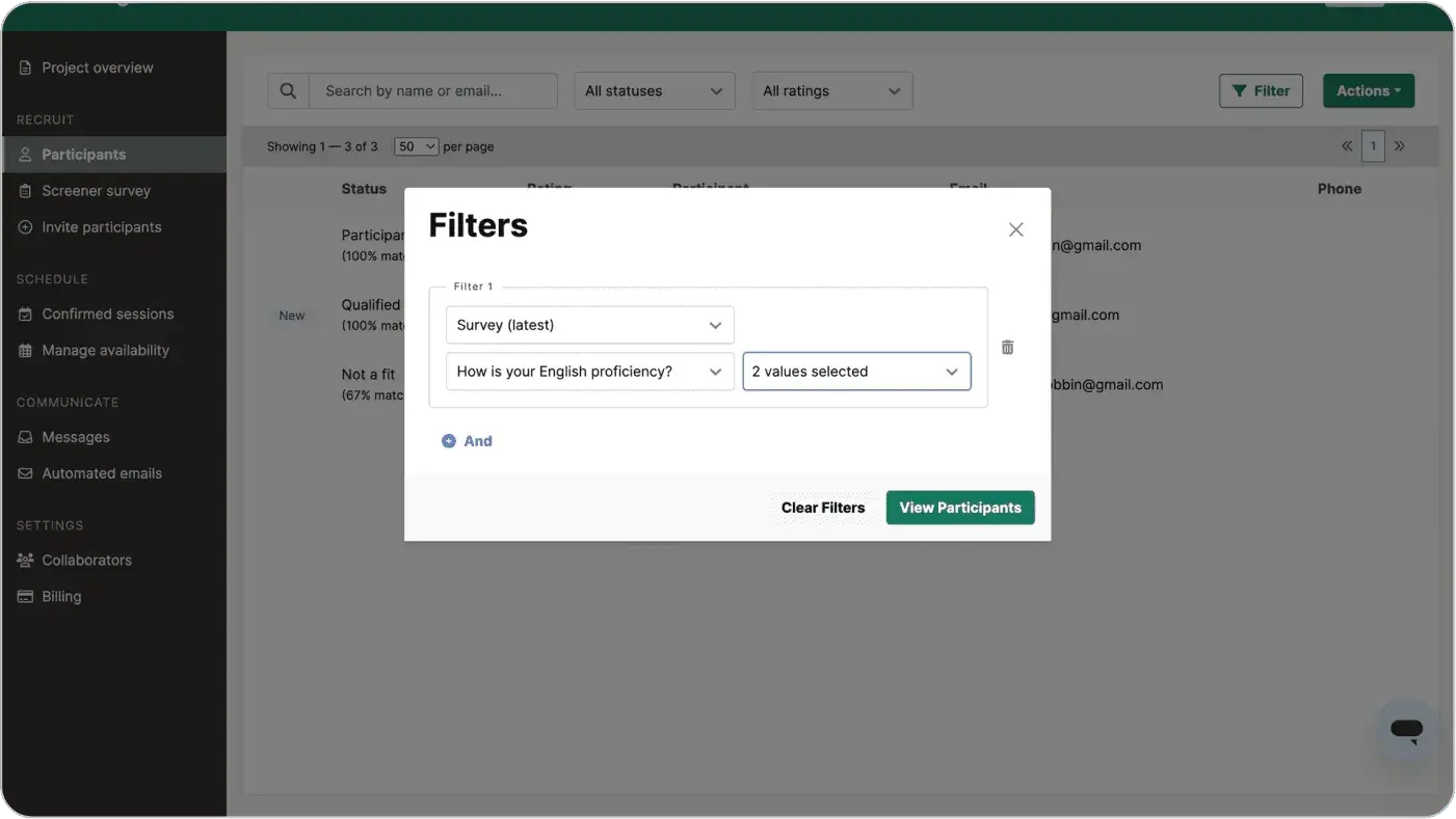
Filter button interactions: popover
A popover is great when you don’t want to lose the context of the listing page.
Filter button: popover
Examples
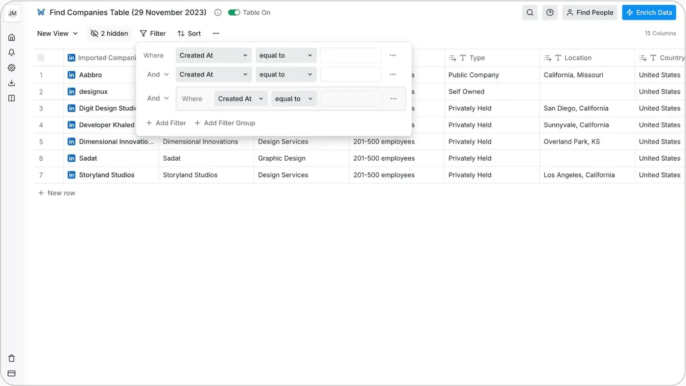
The popover displays the filters in this CRM
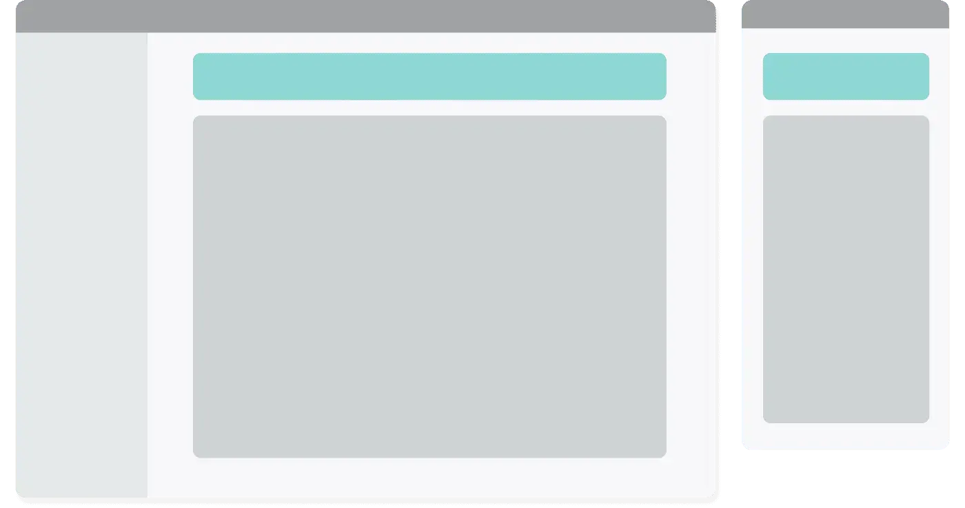
Filter button interactions: Mobile version
All of these could collapse like this on mobile: you could either use a bottom sheet (left) or a full modal (right).
Filter button interaction on mobile: bottom sheet (left), full modal (right)
Examples
The filter button can open a sheet or a full modal on mobile
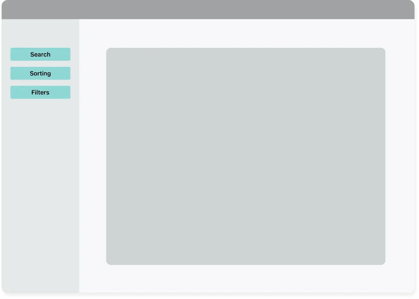
Sorting & Search in a listing
Sorting and search components should be used when there are many results in which the user may not find what he is looking for at first glance.
In particular, the sorting component makes sense when it is difficult for users to identify the extremes; instead, the search component must be clear about its application.
Inside the filtering area
Use when you want to have control and manage everything in one place.
Sorting and searching inside the filtering area
Examples
Example of search and sorting inside the filtering area
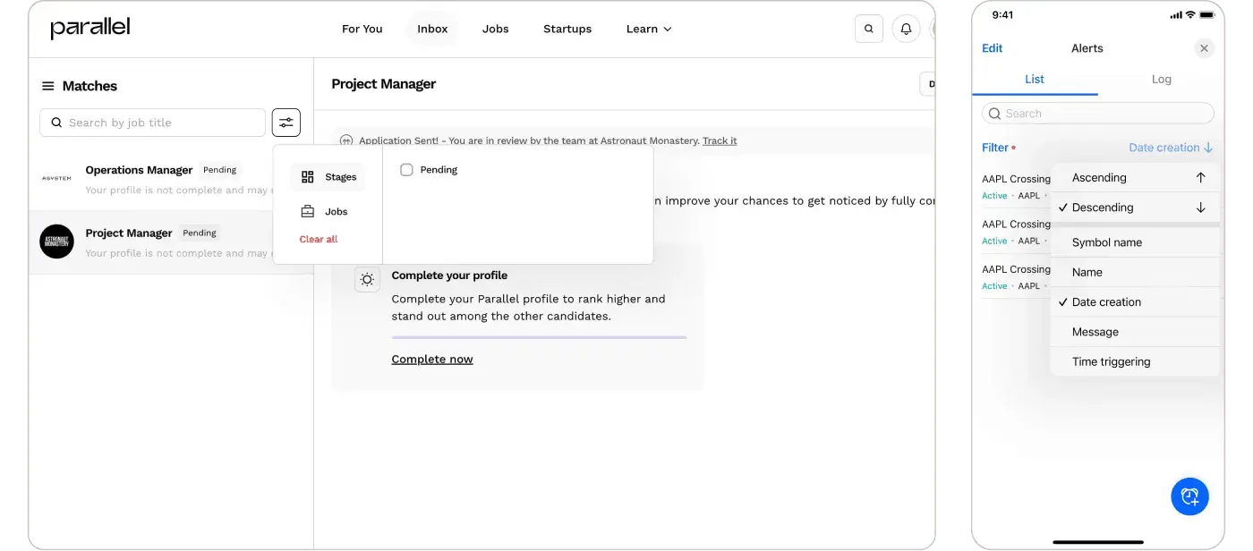
Separated from the filtering area
Best used with tables and card rows.
Search and sorting outside the filtering area
Examples
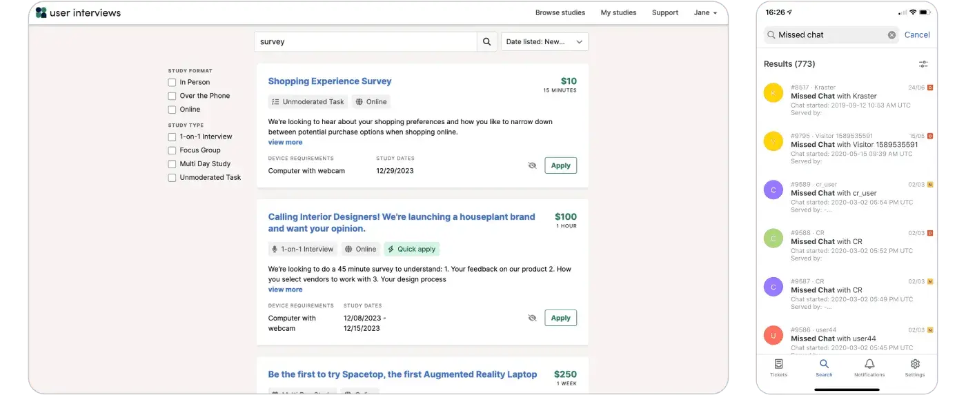
Search and sorting on User Interviews
Dealing with many items
Listing pages usually deal with many items, so it’s important to deal with this accordingly. There are two main patterns we suggest.
Pagination
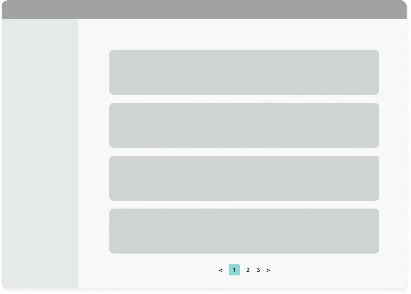
Pagination pattern
Main reasons to use it ✅
- Best pick for a tabular list
- Provides a general overview of the number of elements present
- The user has more clarity and control over the location of the item they are viewing
When not to use it ❌
- Not easy to use on mobile
Examples
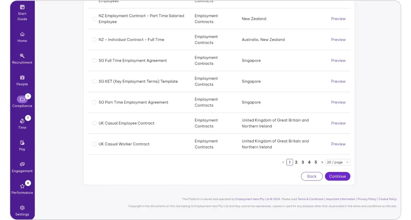
Pagination used on Employment Hero
Load more button
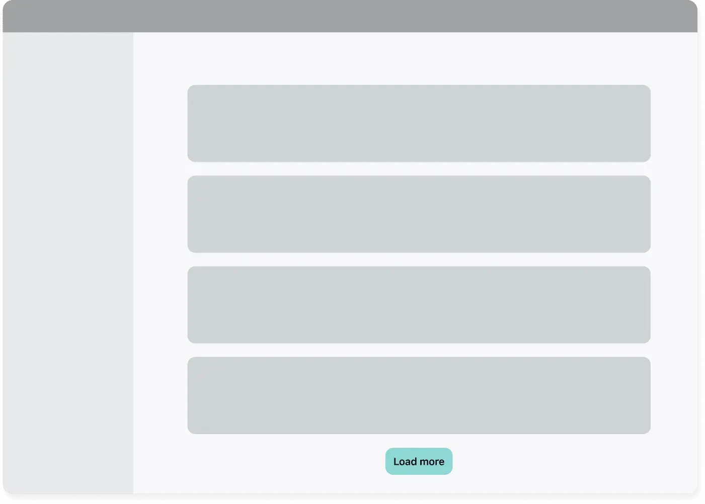
Load more pattern
Main reasons to use it ✅
- Allows access to the footer
- The list grows, and the user can see a greater number of items on the same page
- The user can return to the element of interest without changing the screen
- More usable on mobile than pagination
When not to use it ❌
- Avoid when the users need to review the same set of results multiple times, as you would force them to click the button many times
Examples
GitHub uses the load more pattern on their lists
Split a listing into sections
They must be immediately evident and not hidden on the page
With title
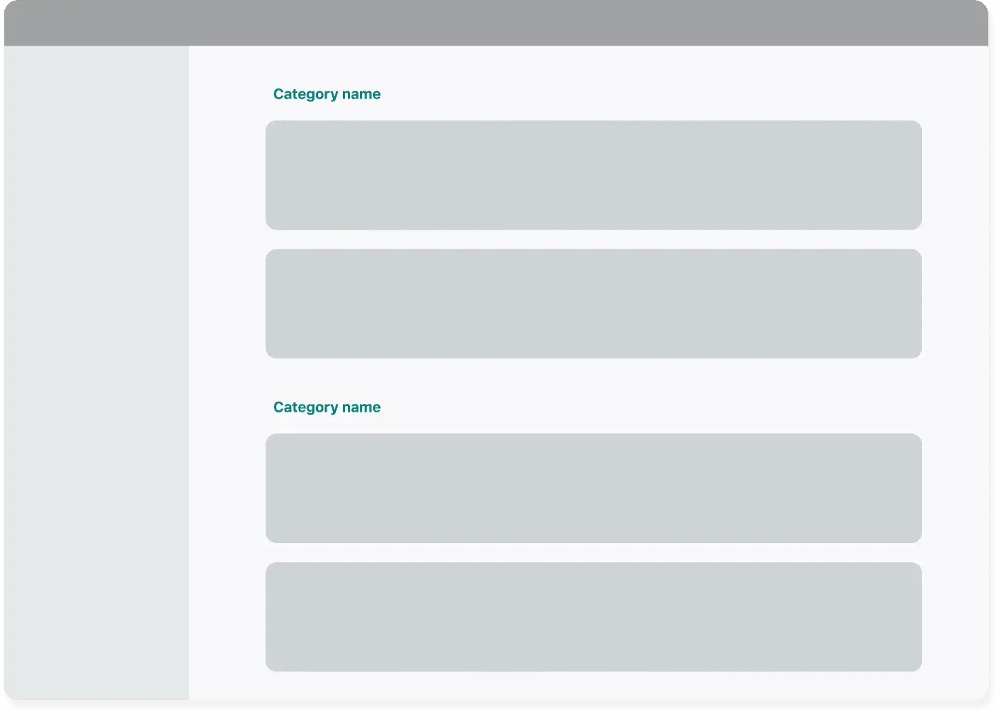
Categories with titles
Main reasons to use it ✅
- Suitable if there is limited content
When not to use it ❌
- They can’t be enough to separate the various sets visually
Examples
Categories with titles in the wild
Tabs
Category with tabs
Main reasons to use it ✅
- they allow you to have a more complete overview of the sections
- suitable when there is a limited number of sections/Categories
- useful in contexts where it is necessary to make a comparison (e.g., on the status of elements)
When not to use it ❌
- If you know beforehand that the number of categories will grow
Examples
Tabs used in the wild
Accordion
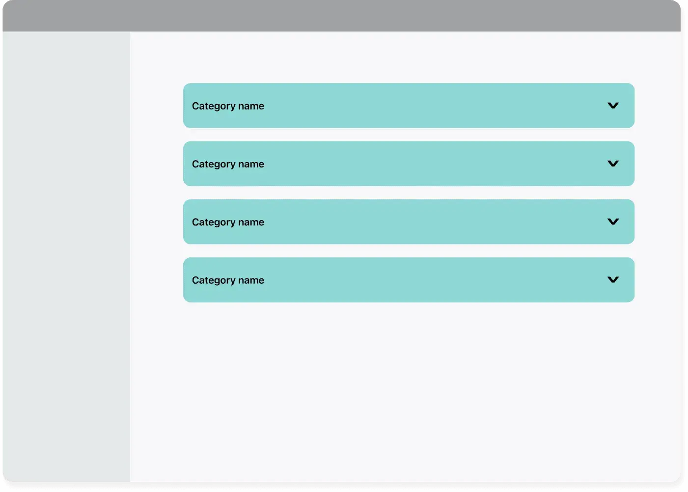
Accordion
Main reasons to use it ✅
✅ Consente di compattare una significativa quantità di contenuti
- Allows you to compact a significant amount of content
When not to use it ❌
- Avoid when it’s essential that the data is seen and not missed by the user
Examples
Asana uses accordions to split its categories
Number of items in a listing
Showing the number immediately provides information to the user without having to count, especially if there are many
By applying the filters you immediately have an idea of the quantity of filtered elements
At the top of the list
More suitable in the presence of an infinite scroll or “load more” button.
Number of elements at the top
Examples
Number of items at the top
At the end of a table (like a counter)
More suitable in the presence of a table list with pagination
Number of elements at the bottom of the list
Examples
Notion shows the number of elements at the bottom of each category
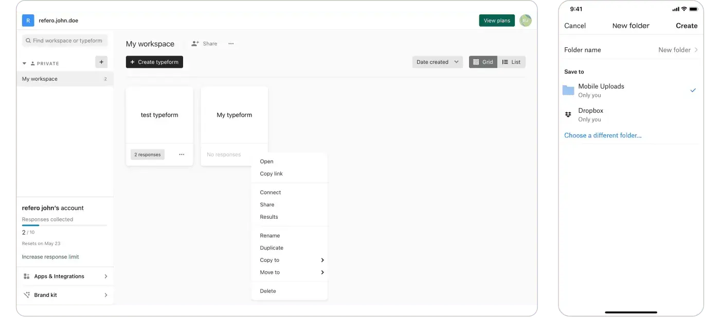
Where to put the main CTA in a listing?
Understanding what the CTA refers to is important, especially if you’re using categories.
Within the header
This is great when used in wizards or for application-wide actions.
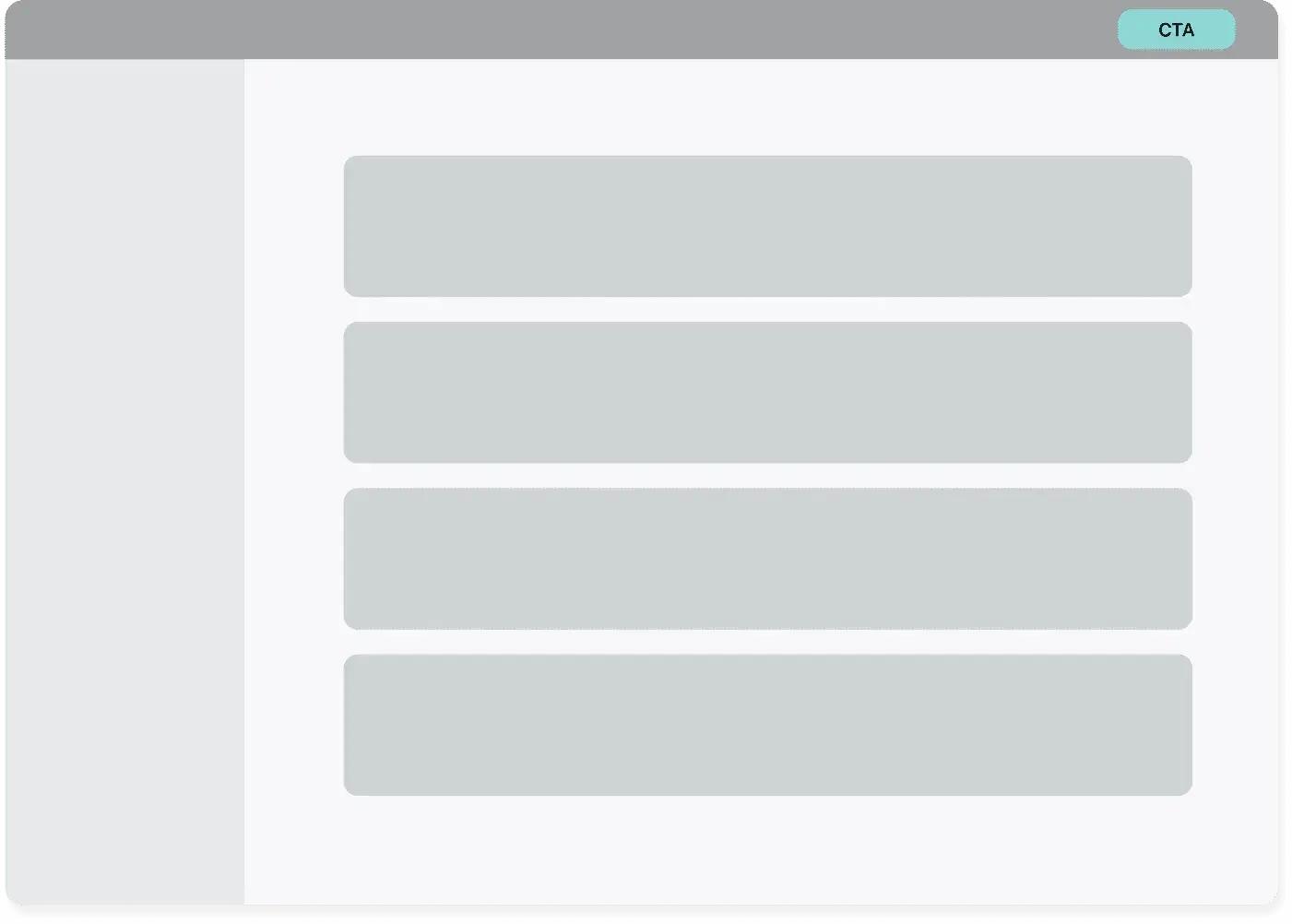
CTA in the header
Examples
Typeform use of CTA in the header
Within the page
Best used when the action involves the items displayed in the listing.
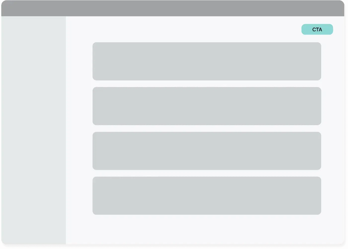
CTA within the page
Examples
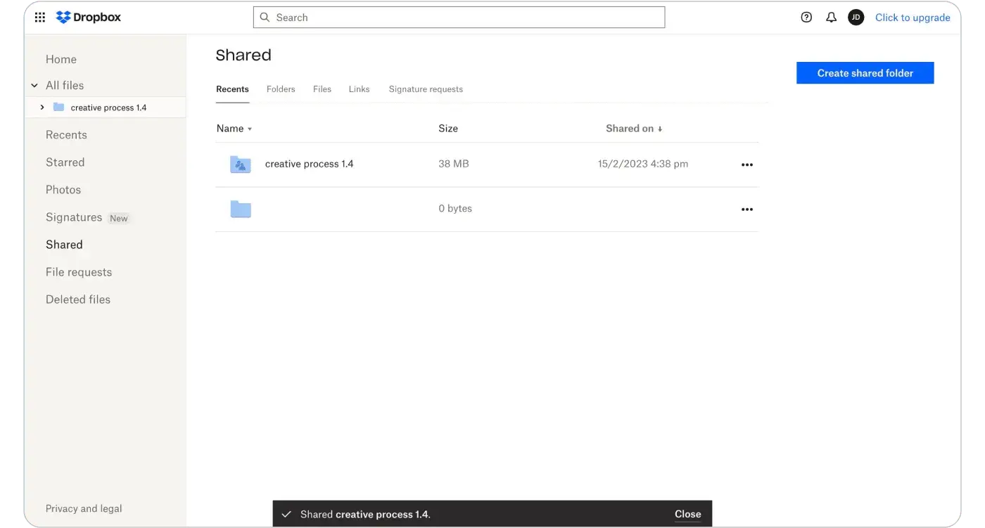
Dropbox using CTA within the page
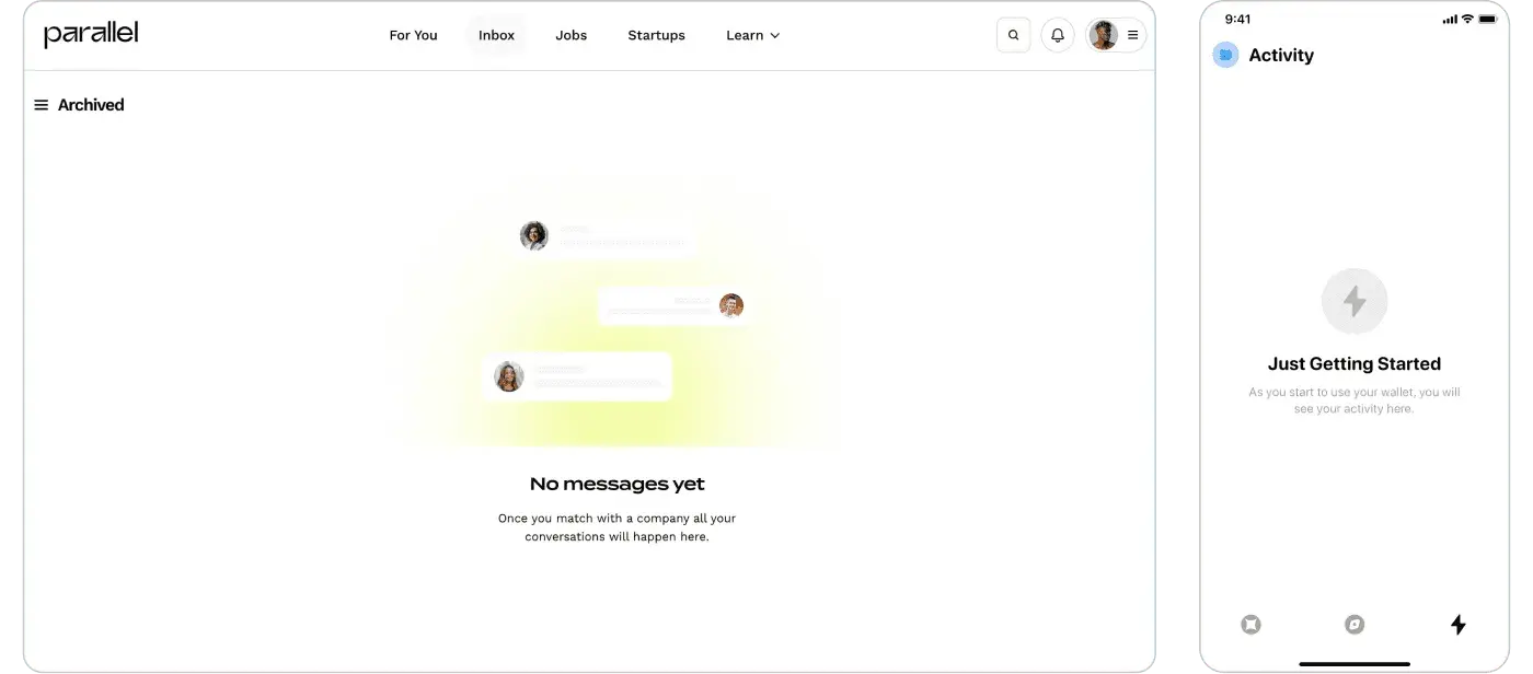
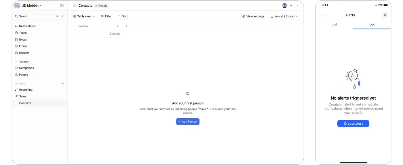
Empty states: dealing with no items
An empty state can help people understand what’s supposed to be there and what the best first action to take to populate the list is.
Basic
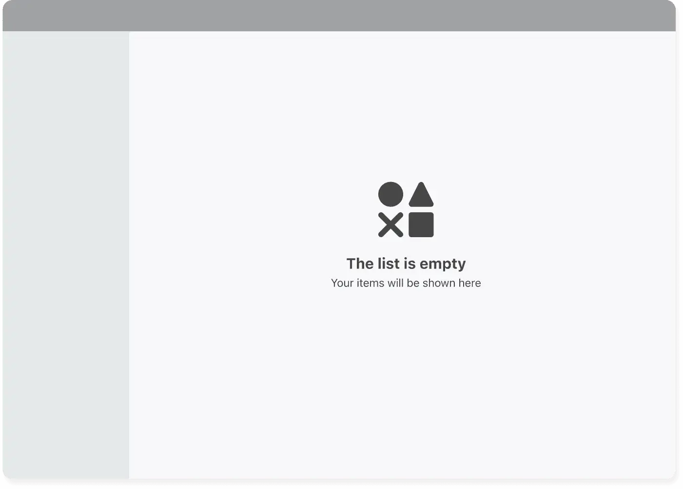
The basic empty state
It features an illustration, a title and a short description of the page’s content
Examples
Examples of basic empty states
With action
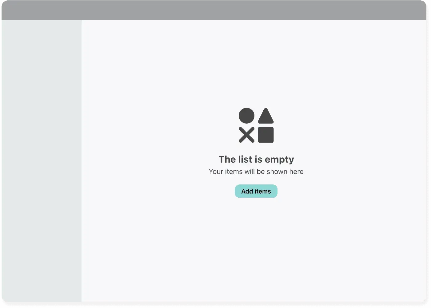
An empty state with a call to action
You can use this when you want to push a certain action when there is no content
Examples
Examples of empty states with action
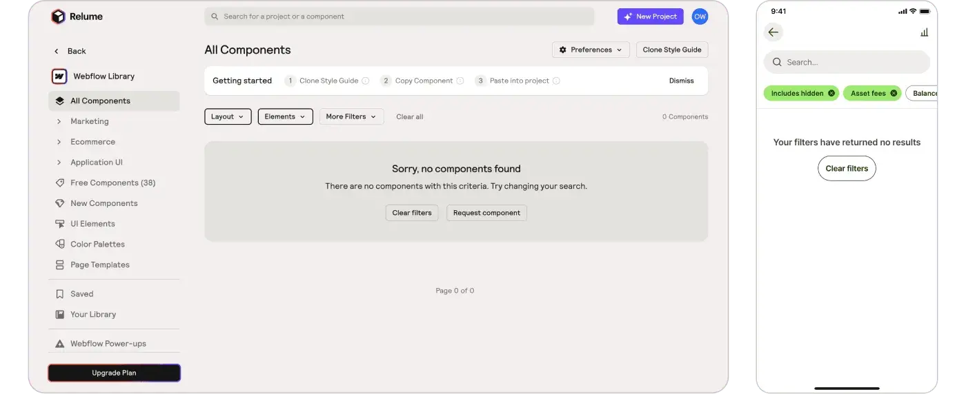
No results found
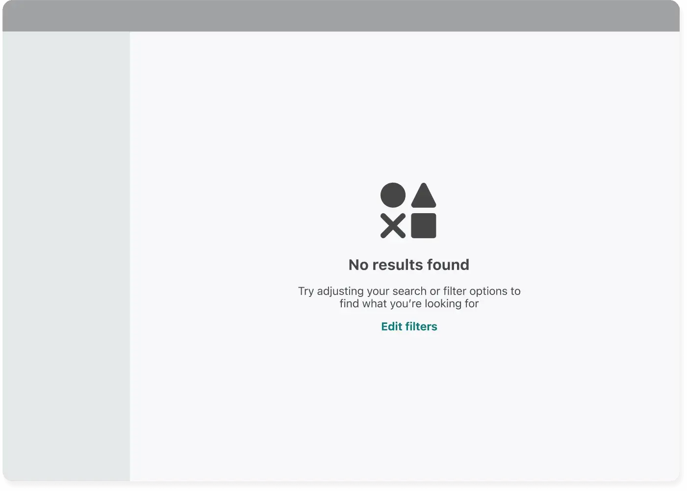
An empty state for a search result page
This is a subset of the previous one: when the listing page is a SERP you can use the empty state to prompt for changing filters
Examples
Empty state for no results page
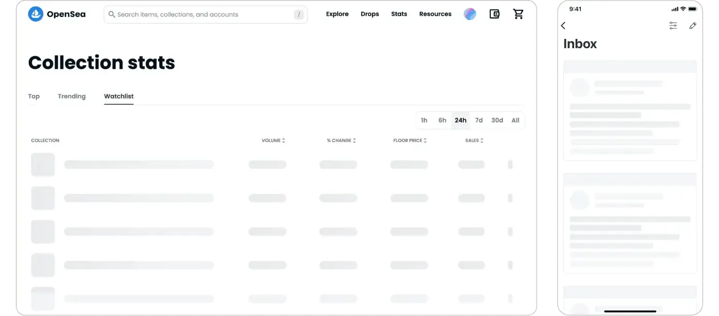
Loading patterns for a listing
Listing pages often require heavy calculations to be rendered, especially on slow connections. Skeletons and loaders give users the feedback they need to understand that the page is still working.
Skeleton
They give the user a hint about the layout of the data, decreasing the chances

Skeleton
Examples
Skeleton used in the wild
Loader
A loader is a great alternative to give feedback to the user about something is about to happen,

Loader
Examples
Example of Loader’s use
What’s next?
Whew! This was a long run, but we hope it will help you design better listing pages for your product. To be notified when the new playbook is released, subscribe to Product Donuts, our newsletter!
:quality(80)/blog/gui-was-a-patch/the-gui-was-a-patch.png)
:quality(82)/blog/introduction-to-design-tokens/pJG6ebrc0tzPoDQWWSZXolLXUPE.png)
:quality(82)/blog/what-is-product-design/6VhmMtqJr7OLx2b5Y0socHpGY.png)