:quality(82)/case-studies/digger/logo.png)
How Digger made AWS deployment clear to developers at first glance
:quality(82)/case-studies/digger/hero-01.png)
:quality(82)/case-studies/digger/hero-02.png)
:quality(82)/case-studies/digger/hero-03.png)
:quality(82)/case-studies/digger/hero-04.png)
The situation
Digger simplifies AWS infrastructure deployment: it generates infrastructure in the customer's own cloud account through a web app, CLI tools and built-in Terraform support.
A powerful product, but infrastructure automation is abstract. As an early-stage startup, Digger needed a landing page that made clear who the product is for and why it matters, for first users and investors alike.
:quality(82)/case-studies/digger/image-02.png)
:quality(82)/case-studies/digger/image-01.png)
Message first
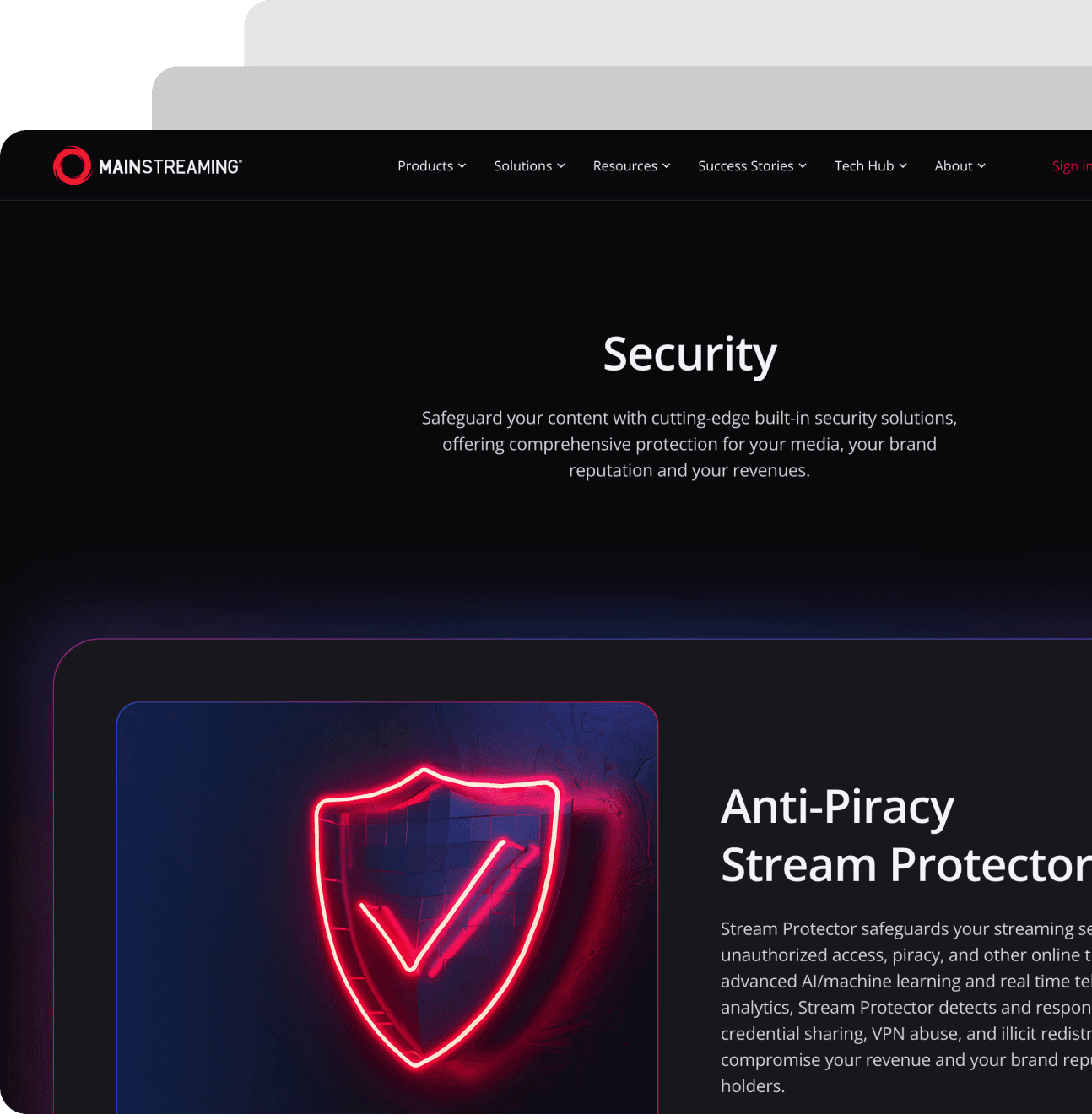
We started from the words, not the layout. Digger's offer became one simple promise: the power of AWS, no hassle. Every section was then designed to prove it.
:quality(82)/case-studies/digger/image-06.png)
:quality(82)/case-studies/digger/image-07.png)
:quality(82)/case-studies/digger/image-08.png)
Answer the questions developers ask
The page follows a developer's natural questions: how fast can I launch, how much control do I keep, what does it cost. One path reassures beginners, another earns the trust of experienced DevOps engineers.
:quality(82)/case-studies/digger/image-09.png)
:quality(82)/case-studies/digger/image-04.png)
Show the product, don't describe it
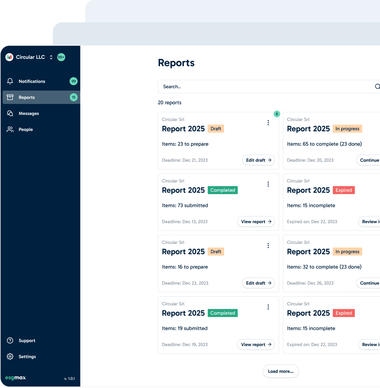
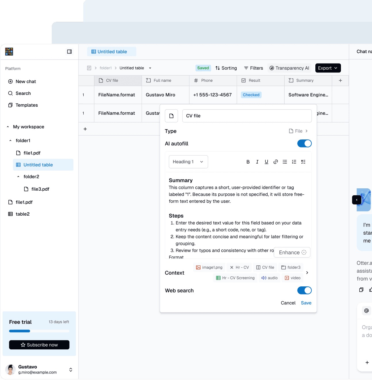
Real product screens, from the AWS connection flow to the services dashboard, a step-by-step launch flow and transparent pricing show how simple deployment is. A dark interface with purple and coral accents and isometric visuals make infrastructure feel tangible.
:quality(82)/case-studies/digger/image-03.png)
:quality(82)/case-studies/digger/image-05.png)
The result
Digger got a page that explains a complex product in seconds, with customer quotes and clear calls to action to try it for free. For its CEO, the way we got there mattered as much as the page itself.
:quality(82)/case-studies/digger/image-10.png)
Testimonial
Donux has this structured process that I haven't ever seen before. It makes so much sense and wastes so little time. It removes all the back and forth that I'd normally expect working with a vendor. Everything is clear.

Great product, but people don't get it from your website?
We fix the message first, then design a site that proves it.
More Case Studies