Build a Stunning Website with Framer: Beginner's Guide
Learn how to design and launch responsive, user-focused SaaS websites using Framer. This guide covers stacks, components, animations, and best practices for beginners and teams.
:quality(82)/blog/authors/yana.webp)
:quality(82)/blog/build-a-stunning-website-with-framer-beginner-s-guide/bYU08WYhlD2NinlQKdSzRWlb1w.png)
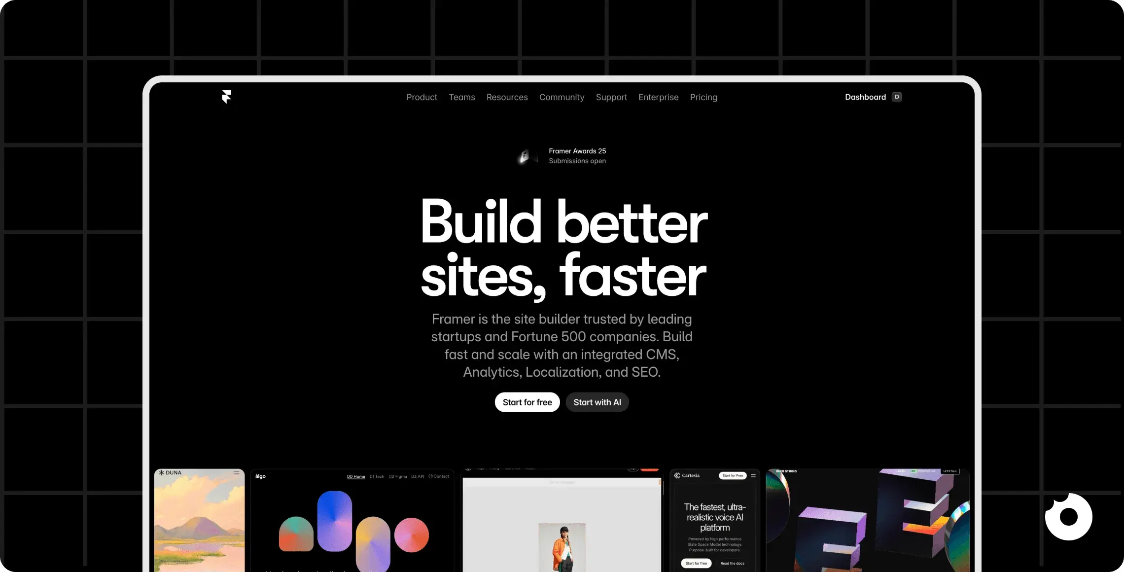
For CEOs, startup founders, and product managers in the SaaS industry, creating scalable, user-focused designs can often feel like a daunting task. The challenge of converting innovative ideas into functional, responsive, and aesthetically pleasing web designs is a common pain point. Enter Framer - a design and prototyping tool that promises to simplify and transform website building. This article breaks down the process of creating a visually stunning website using Framer, focusing on actionable insights and best practices. Whether you’re a beginner or looking to refine your expertise, this guide will help you unlock Framer’s potential.
Why Framer Stands Out in Website Development
Framer has gained significant traction in the design community for its simplicity and power. It merges visual design with clean, responsive code, offering a seamless way to create professional-grade websites. For SaaS professionals, the tool’s ability to integrate design and code workflows efficiently is a game-changer. With features like responsive components, reusable styles, and visual animations, Framer helps you build websites that aren’t just visually appealing but also well-optimized for scaling.
In this guide, we’ll walk through the process of building a website from scratch with Framer, focusing on its fundamentals while showcasing how to create a cohesive, responsive design. Let’s get started.
Step-by-Step Guide to Building a Website in Framer
1) Getting Started with Framer: The Basics
Before diving into Framer’s more advanced features, it’s essential to understand its basic interface and structure:
- Pages and Frames: The core building blocks of Framer are frames (containers for content) and pages (the overall canvas). Frames act as wrappers for elements like text, images, and buttons.
- Pre-Built Components: Framer includes a library of pre-designed components, such as navigation menus and buttons, which can be customized to fit your branding.
- One-Click Figma Import: If you’re starting from a Figma design, Framer allows you to import your file directly, saving time on layout creation.
To learn the fundamentals, let’s build a homepage for a fictional burger website.
2) Step 1: Setting Up a Background
Every website begins with a cohesive background that sets the tone for the design. In Framer:
- Navigate to the Styles panel to select or add a shared color. For instance, a “dark gray” background can provide a sleek, modern aesthetic.
- Assign the background color to your homepage frame. Shared styles make it easy to maintain consistency across different sections of your website.
Pro Tip : By naming and saving colors (e.g., “Dark Gray” or “Brownie”), you create a reusable palette, streamlining future edits.
3) Step 2: Adding Responsive Navigation
Framer simplifies the creation of responsive navigation menus:
- Drag and drop a navigation component from the library. For example, a “dark navigation” bar includes built-in responsiveness, automatically converting to a hamburger menu on mobile devices.
- Customize the navigation bar by:
-
Changing the background color to match your theme.
-
Editing text styles (e.g., transforming menu text into uppercase).
-
Aligning fonts with your brand identity using Google Fonts like “Bai Jamjuree” or “Inter.”
-
Why This Matters: Responsive navigation ensures a seamless user experience across devices, a critical factor for retention metrics in SaaS platforms.
4) Step 3: Structuring Layouts with Stacks
Framer’s stacking system is a powerful layout tool for organizing content:
- A stack defines how elements are aligned, horizontally or vertically, and establishes spacing (gaps) between them.
- Use stacks to create distinct sections, such as a hero area (header), product details, and testimonials.
For our burger website, the hero section might include:
- Hero Text: A compelling headline like “Burgers Above All Burgers.”
- Hero Image: A visually striking image of a burger.
- Hero Info: Supporting details or a call-to-action.
By assigning clear names to sections (e.g., “Hero Text”, “Hero Image”), you maintain an organized structure, making it easier to edit later.
5) Step 4: Animating Text and Images
Animations bring websites to life. Framer’s motion components allow you to create engaging animations without any coding knowledge:
-
Add motion text to your hero section and customize its animation settings. For instance:
-
Animate headline text by line or word.
-
Adjust animation speed and delay for a polished effect.
-
-
Similarly, apply animations to images. For example:
- Use a “scale-in” effect on a hero burger image, creating a dynamic entrance.
Pro Tip: Delaying image animations slightly after text animations adds a professional touch, guiding the user’s focus naturally.

6) Step 5: Creating a Feature Section
To highlight product features, such as the unique qualities of your burger, use a two-column layout:
- Column 1: Text content, including a headline and description. Use pre-defined text styles like H2 for headings and paragraphs for body text.
- Column 2: Supporting visuals, such as icons or additional images.
Turn the frame into a layout stack for easy alignment and spacing. Add padding to ensure the design feels clean and uncluttered.
7) Step 6: Designing Buttons as Components
Buttons are critical for driving user actions, such as sign-ups or purchases. In Framer:
-
Create a reusable button component with primary and hover states:
-
Primary State: A bold color (e.g., “Brownie”) with a drop shadow.
-
Hover State: A contrasting color (e.g., “Purple”) with adjusted shadows to mimic an interactive click.
-
-
Style the button using Framer’s layout tools, adding sufficient padding and ensuring accessibility with clear text contrast.
By using components, you ensure style consistency across your site while saving time on updates.
8) Responsive Design
Responsive design is crucial for modern websites. Framer’s stack system makes it easy to adjust layouts for different screen sizes:
- Set frame widths to percentages (e.g., 90% of the viewport).
- Test responsive behavior using Framer’s built-in preview tool.
For the burger website, ensure sections like the hero area and feature rows adapt seamlessly to tablet and mobile devices.

Key Takeaways
- Framer’s Strength: Offers a beginner-friendly interface combined with advanced design capabilities, making it ideal for SaaS professionals looking to create scalable and responsive websites.
- Reusable Components: Using components for navigation and buttons streamlines updates and maintains consistency across pages.
- Stacks for Layouts: Framer’s stack system simplifies responsive design, enabling precise control over alignment and spacing.
- Motion Animations: Adding animations to text and images enhances user engagement and creates a polished, interactive experience.
- Responsive Design: Testing layouts on varying screen sizes ensures usability across devices, supporting higher onboarding and retention metrics.
Conclusion
Framer empowers SaaS leaders to bridge the gap between design and functionality, allowing teams to craft websites that are visually stunning, scalable, and responsive. By mastering its tools, such as stacks, animations, and components, you can create user-focused designs with efficiency and precision.
Whether you’re building a product landing page, a knowledge base, or a customer-facing portal, Framer’s flexibility makes it a valuable addition to your workflow. The key is to start small, focus on foundational skills, and iterate over time. With practice, the possibilities are limitless.
At Donux, we help B2B SaaS teams build websites with Framer safely and strategically. We focus on creating scalable design systems, reusable components, and responsive layouts while ensuring a smooth handoff between design and engineering.
If you are planning to launch a Framer website or want to validate your approach before committing, book a discovery call with us. We will help you de-risk the process and deliver a polished, production-ready site with confidence.
:quality(82)/blog/framer-free-plan-limitations/D6LrG6lP0o1gWiwBm8yejFMmDg.png)
:quality(82)/blog/design-to-code-with-framer-streamline-handoff-to-engineering/YYgyBaUNQk6f2ZNm4oby70kVYE.png)
:quality(82)/blog/migrate-to-framer-playbook/3kZzbiKKme7iGVebPL3Sg91ilo.png)