The Bowling Alley Framework: A Practical Guide to PLG Onboarding
A practical framework for designing SaaS onboarding that guides users straight to value while reducing friction at every step
:quality(82)/blog/authors/yasmine.webp)
:quality(82)/blog/bowling-alley-framework-saas-onboarding/zipKCdUfQlfzxhrNmswxkH8SQoU.png)
Most SaaS onboarding flows are too long, too complex, and ask users to do too much before they see any value. The result: 40-60% of people who sign up for a free trial will use it once and never come back.
The Bowling Alley Framework, introduced in the book Product-Led Growth by ProductLed, is one of the most practical tools for fixing this. It gives you a structured way to strip your onboarding down to what matters, add guardrails that keep users on track, and compress the time between signup and value.
If you’re already familiar with what product-led growth is, this guide goes deeper into the onboarding mechanics that make or break a PLG strategy.
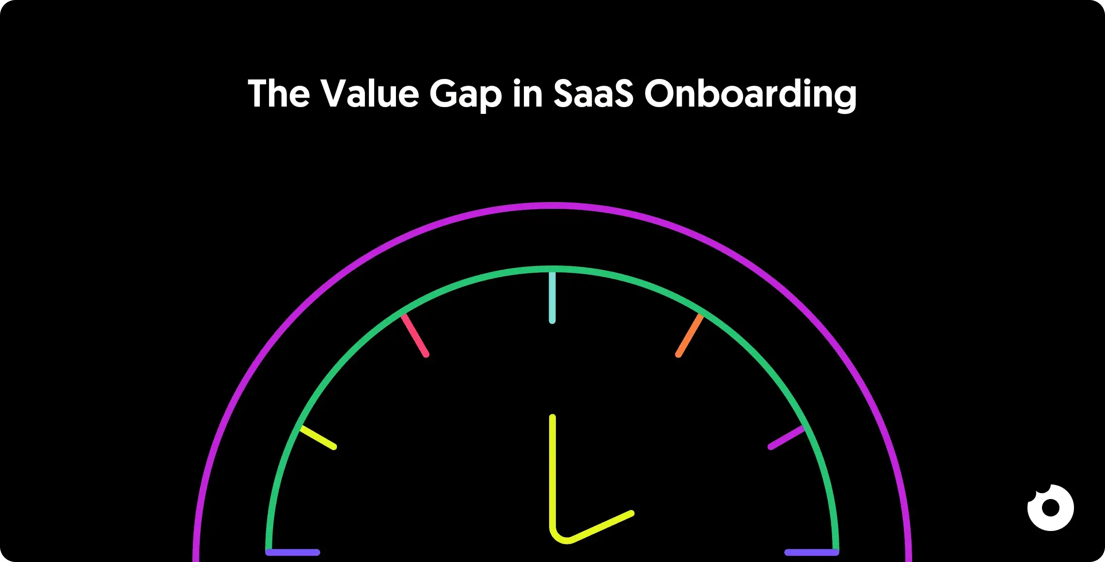
The Problem: The Value Gap
Every SaaS product makes a promise. Your landing page says “save time,” “increase revenue,” or “simplify your workflow.” The value gap is the distance between that promise and the moment a user actually experiences it.
That distance is measured in time-to-value (TTV), and it’s the most critical number in PLG. The average TTV across SaaS products is 1 day, 12 hours, and 23 minutes. Top PLG companies aim for under 5 minutes.
The gap exists because onboarding flows are designed around what the product needs (account setup, integrations, configuration) rather than what the user needs (proof that this product solves their problem).
The numbers are stark:
- 90% of users churn if they don’t understand product value within the first week
- Every extra minute in TTV lowers conversion by approximately 3%
- 75% of users abandon within the first week if onboarding is poor
- Activation rates below 25% predict massive churn downstream
The Bowling Alley Framework is designed to close this gap systematically.
How the Bowling Alley Framework Works
The metaphor is simple. In bowling, bumpers keep the ball rolling toward the pins even if the bowler’s aim is off. In onboarding, bumpers keep users moving toward their first moment of value even when they get confused, distracted, or stuck.
The framework has three components:
- The Straight Line - the shortest path from signup to value
- Product Bumpers - in-app guardrails that keep users on track
- Conversational Bumpers - out-of-app outreach that re-engages users who drift
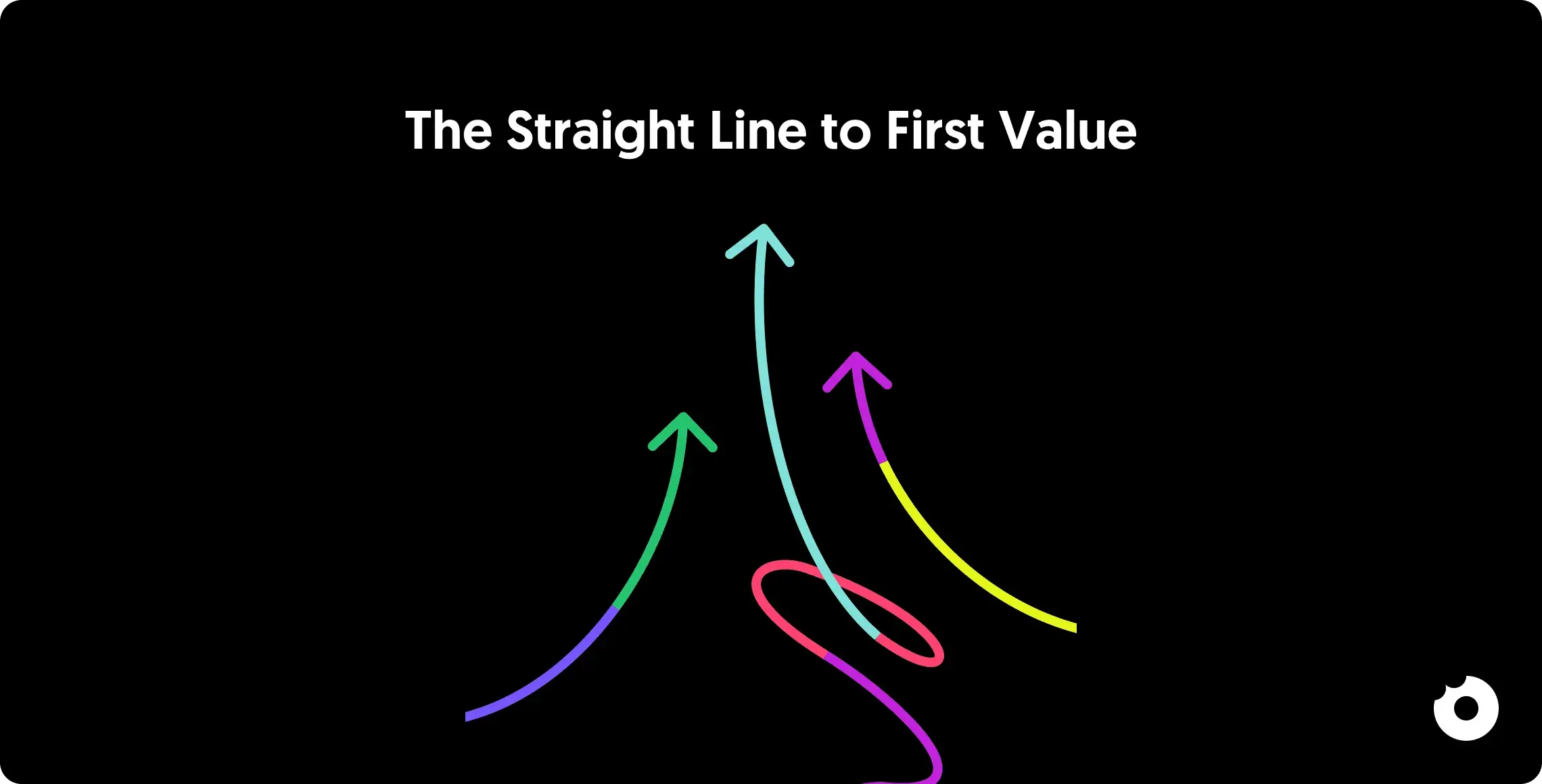
Step 1: Design the Straight Line
The straight line is the minimum set of steps a user must complete to experience the product’s core value. Not every feature. Not every setting. Just the absolute essentials.
Identify the Mission-Critical Steps
Ask: what does a user absolutely have to do before the product works?
For Google Analytics, that’s installing a JavaScript snippet on your website. Without it, the product shows nothing. For Slack, that’s creating a workspace and inviting at least one teammate. Without that, the product is an empty chat room.
Map every step in your current onboarding flow, then classify each one:
| Classification | Definition | Action |
|---|---|---|
| Green (Essential) | Cannot experience value without this step | Keep on the straight line |
| Yellow (Helpful) | Improves the experience but isn’t required for first value | Delay until after activation |
| Red (Unnecessary) | Doesn’t contribute to first value at all | Remove entirely |
Companies that apply this classification remove 30-40% of onboarding steps and delay another 20%. The result: users experience core value 2-3x faster.
The Rules for the Straight Line
Eliminate first. Every form field, every settings page, every “complete your profile” screen that doesn’t directly lead to value is a leak. If you can ask for it later, do.
Delay second. Integrations, team invitations, notifications settings, and preferences can wait. Introduce them contextually after the user has experienced value and is motivated to invest more time.
Then simplify what remains. For the steps that survive the cut, reduce friction. Can you auto-fill fields? Can you provide smart defaults? Can you let users skip and come back?
A practical test: can a new user get to their first meaningful outcome in under 5 minutes? If not, your straight line is too long.
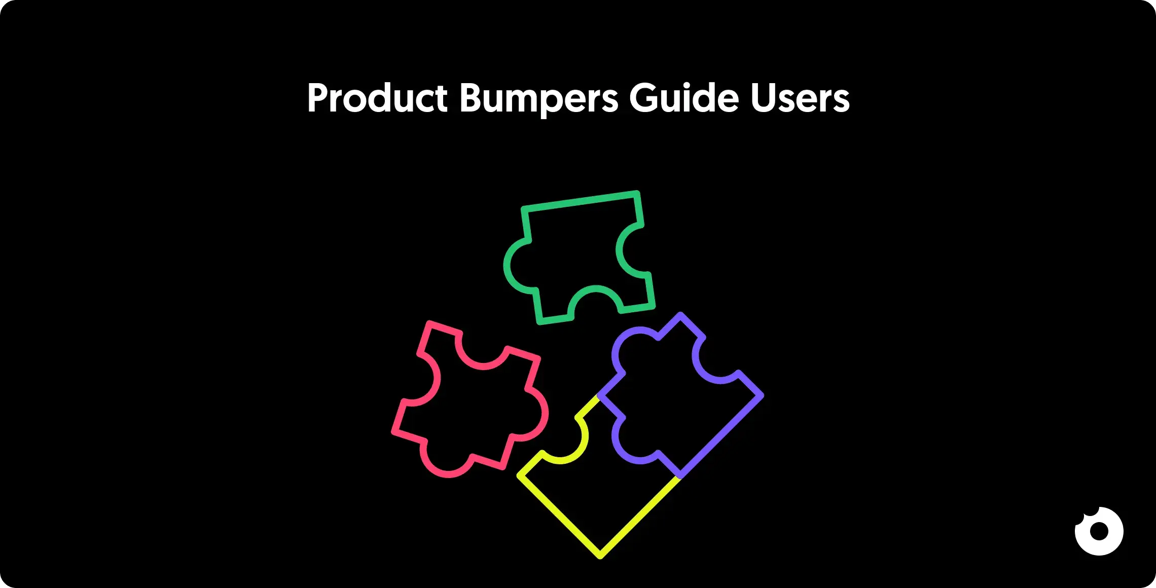
Step 2: Add Product Bumpers
Once the straight line is defined, add in-app mechanisms that keep users on track. These are product bumpers, and they activate inside the product when a user hesitates, gets confused, or skips a step.
Welcome Messages
Use the first screen to set expectations. A brief, outcome-focused message that tells users what they’ll achieve (not what they’ll configure) frames the entire experience. “You’ll send your first invoice in under 3 minutes” is more motivating than “Let’s set up your account.”
Product Tours
Tailored walkthroughs that highlight the 2-3 key actions a user needs to take. The research is clear: effective product tours run 3-5 steps maximum. Anything longer and completion rates drop sharply.
Guide users to a quick win. An accounting app might walk users through uploading their first receipt and generating an invoice. A project management tool might help create a first task and assign it. The goal is to reach the “Aha!” moment as fast as possible.
Checklists
Simple, visible lists of the steps users need to complete. Checklists work because they provide structure, create a sense of progress, and tap into the completion effect (the psychological drive to finish what you started).
Sked Social found that users who completed their onboarding checklist were 3x more likely to upgrade to paid.
Empty States
Blank dashboards are missed opportunities. Instead of showing an empty screen, prompt users to take the action that populates it. If your product has a dashboard, pre-load it with sample data or guide users to connect their first data source. Show what the product looks like when it’s working, not when it’s empty.
Tooltips and Contextual Help
Context-specific nudges that appear when a user hovers over or interacts with a specific element. Tooltips work best when they explain the benefit of an action, not just how to do it. “Pin this channel to find it faster” beats “Click here to pin.”
Used well, in-app activation nudges can significantly improve trial-to-paid conversion rates. But over-doing it creates tooltip fatigue. Use them sparingly, at the moments that matter most.
Step 3: Add Conversational Bumpers
Not every user stays in the product long enough for product bumpers to work. Conversational bumpers extend the guidance outside the product, reaching users through email, SMS, or push notifications at critical moments.
The principle comes from Toyota’s just-in-time manufacturing: deliver the right information at the right moment based on where the user actually is in their journey, not on a pre-set drip schedule.
Signal-Based Triggers
The key is using behavioral signals, not timers, to trigger outreach:
- User signed up but never completed setup? Email with a direct link back to the exact step they abandoned.
- User uploaded content but didn’t share it? Nudge them toward the sharing action that unlocks the product’s core value.
- User was active for 3 days then went silent? Re-engagement email highlighting what they’ll miss.
- User completed onboarding but hasn’t invited teammates? Prompt the team expansion that drives stickiness.
Channel Selection
Match the channel to the urgency and context:
- Email: Best for re-engagement, onboarding sequences, and users who’ve gone quiet. Lower urgency, higher detail.
- In-app notifications: Best for guiding active users to the next step. Contextual and immediate.
- SMS / push: Best for time-sensitive nudges. Use sparingly to avoid being intrusive.
The goal is to create a seamless loop between in-product and out-of-product guidance, so users always have a clear next step no matter where they are.
For more on building the feedback infrastructure that makes conversational bumpers smarter over time, see our guide on onboarding feedback loops.
After Onboarding: From Activation to Expansion
The Bowling Alley Framework focuses on getting users to their first moment of value. But PLG doesn’t stop at activation. The best onboarding flows are designed with the full user lifecycle in mind.
Make the Upgrade Path Obvious
When users hit the boundary of the free tier, the upgrade experience matters enormously. A confusing pricing page or a forced “talk to sales” gate at this moment can undo everything the onboarding accomplished.
Design the upgrade trigger to feel like a natural extension of the value the user already experienced, not a paywall they’ve collided with.
Drive Team Expansion
For collaborative products, team expansion is often the biggest growth loop. Design invitation flows that are:
- Low-friction (one-click invite links, shareable project URLs)
- Value-framed (“Invite your team to collaborate on this project” beats “Add team members”)
- Contextually triggered (prompt invitations after the user completes a collaborative action)
Personalize for Segments
Role-based onboarding flows significantly outperform one-size-fits-all approaches. A welcome survey with 1-2 questions (role, primary use case) lets you route users to the straight line that matches their context. For guidance on conducting these interviews, see our user interviews guide.
Canva cut their TTV in half by personalizing onboarding paths based on what users said they wanted to create.
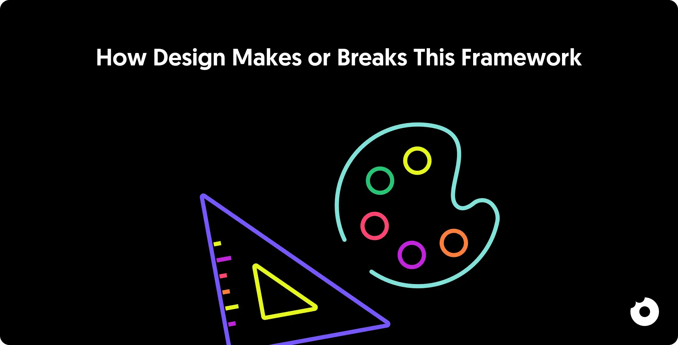
How Design Makes or Breaks This Framework
The Bowling Alley Framework is a strategic tool, but its effectiveness depends entirely on execution. And execution is design.
Every component of the framework is a design decision:
- The straight line is an information architecture problem. What do you show? What do you hide? What do you defer?
- Product bumpers are interaction design problems. How visible is the checklist? How intrusive are the tooltips? How does the tour flow feel?
- Conversational bumpers are content design problems. What’s the subject line? What’s the CTA? How does the email look on mobile?
- Empty states are visual design opportunities. Do they guide, delight, and motivate, or do they just say “no data yet”?
After working on 80+ SaaS products, we’ve seen that the difference between onboarding that activates and onboarding that leaks is almost always in the design details. The strategy can be identical. Two products can both use checklists, tours, and email sequences. But the one with better visual hierarchy, clearer copy, and smoother transitions will outperform every time.
If you want a structured evaluation of where your onboarding design is creating friction, a UX audit is the most efficient starting point. For setting up the analytics that measure what’s working, see our product analytics guide.
Conclusion
The Bowling Alley Framework gives you a repeatable method for designing onboarding that works. Map the straight line. Classify every step as green, yellow, or red. Remove or delay everything that isn’t essential. Add product bumpers to keep users on track. Add conversational bumpers to re-engage users who drift.
The benchmarks are worth keeping in mind: companies that apply this framework remove 30-40% of onboarding steps, get users to value 2-3x faster, and see meaningful improvements in activation and conversion. But the framework only works if the execution is right. The quality of the design, from the first welcome screen to the upgrade trigger, determines whether users activate or bounce.
Start with the straight line. That’s the highest-leverage change. Everything else builds on getting users to value as fast as possible.
Want to redesign your onboarding for faster activation? Talk to our team - we’ve helped 80+ SaaS companies design product experiences that convert.
:quality(80)/blog/gui-was-a-patch/the-gui-was-a-patch.png)
:quality(82)/blog/pragmatic-b2b-saas-design-listing/GvPwajE4C3d7q8qkK9y2Lgmpd0.png)
:quality(82)/blog/introduction-to-design-tokens/pJG6ebrc0tzPoDQWWSZXolLXUPE.png)